
Choose Your Print Size
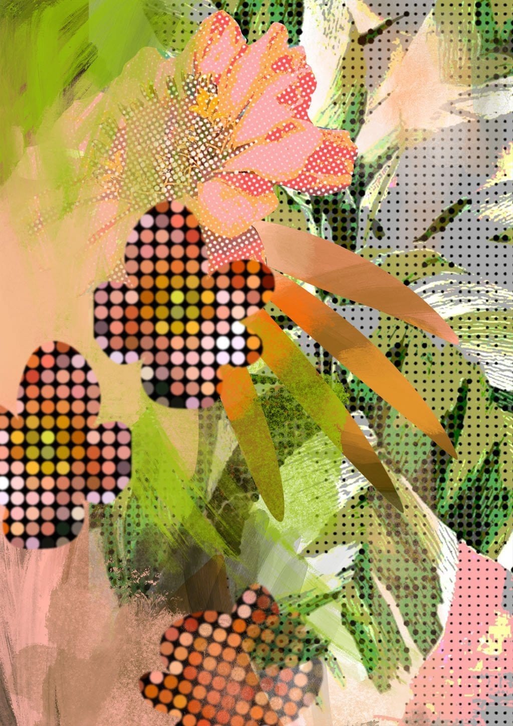
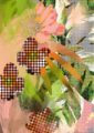
This artwork, titled “Tropical Polka”, would make a cheerful and energising addition to many homes. The vibrant pink and green colour palette immediately catches the eye and evokes a sense of tropical warmth and lushness. The organic, abstracted floral and palm frond shapes, rendered in an intriguing pixelated style, provide dynamic movement and visual interest.
Dancing shadows under palm trees. A sweet scented floral symphony on the salty sea breeze. The juxtaposition of playful polka dots with the more freeform botanical elements creates an engaging contrast that keeps the eye moving around the composition, discovering new details.
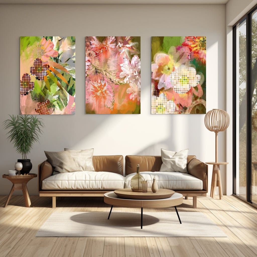
The uplifting colours and lively energy would brighten any room, perhaps serving as a focal point in a living room, dining area, or bedroom. The tropical theme could complement coastal or bohemian decor especially well. At the same time, the modern, slightly abstract style makes it versatile enough to suit various interior design aesthetics.
Overall, “Tropical Polka” radiates joyful, carefree exuberance. It’s the type of art piece that could lift the mood in a space, evoking the rejuvenating feel of a sunny beach getaway. For those drawn to bold colours, organic shapes, and a touch of whimsy, this artwork could be the perfect fit to enliven their home with a breath of fresh, salty air.
I see you like abstract art, so here are some more Abstract Wall Art Prints for your perusal.
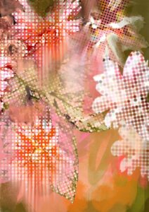
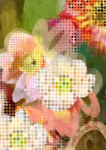
Coral-pink blooms, warm sage and lime green, burnt orange, soft blush, and deep charcoal dots: these are the colours at the heart of this print, and together they run warm throughout, grounded by earthy undertones rather than cool blue ones. For walls, a warm off-white or soft cream – something with a yellow or peachy lean rather than a grey one – lets the coral and orange hold their warmth without competition, working on a tonal, analogous logic that pulls from the print’s own palette. If you want contrast, a deep forest green or muted olive reads as a near-complementary foil to the coral and blush, drawing out the botanical layer. A dusty terracotta wall takes the analogous route even further, making the whole composition feel sun-drenched and intentional. This print genuinely suits a maximalist interior, a retro-modern or pop-art-inflected space, a tropical or biophilic room, and a playful eclectic scheme – styles a stylist would reach for here rather than assume. It earns its place in a living room, a dining room with good natural light, a creative studio, or a bedroom where something cheerful but not saccharine is wanted above the bed or beside a window. It belongs to the Polka Flora collection, which blends rhythmic polka-dot repetition with fragmented, pixelated floral forms into what the artist describes as a "joyous art fusion" – and pairing it with other prints from the collection makes a gallery wall that holds together with real coherence. It would make a considered gift for someone moving into their first home, a design-conscious friend, or anyone who loves botanicals with an edge.
Printed with archival pigment inks on Enhanced Matte art paper – a smooth, gallery-grade stock with a soft, glare-free surface – this is a museum-grade print that sits quietly and confidently on a wall without shine or glare distorting the colour. The matte finish is equally at home in a slim oak or black metal frame as it is in a heavier ornate one, since there is no reflective surface to fight with. At A4 or A3, it works on a shelf ledge, a bedside table arrangement, or as part of a mixed gallery wall. A2 and A1 have enough presence to act as a standalone statement – above a sofa, beside a staircase, or centred on a feature wall where the dot patterning can be properly read from across the room. At A0 the print becomes genuinely room-anchoring, the kind of piece a dining or living room is arranged around rather than into. This print is also available as a ready-to-hang canvas print measuring 28×40 inches (70×100 cm), requiring no frame.