
Choose Your Print Size
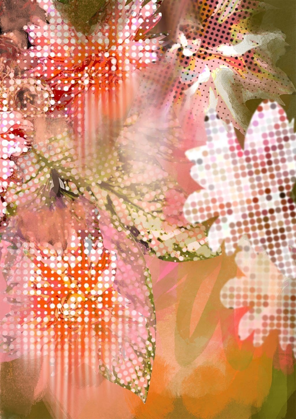
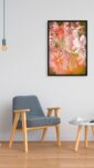
This colorful, abstract artwork could make a great accent piece to liven up any room in a home. The vibrant pinks, oranges and greens convey a sense of warmth and energy, capturing the feeling of heat flares and hot humid nights at the end of a long summer.
The polka dot patterns add a fun, playful element that prevents the piece from taking itself too seriously. Meanwhile, the pixelated, glitchy botanical shapes on the right introduce an intriguing modern digital aesthetic to balance the retro polka dots.
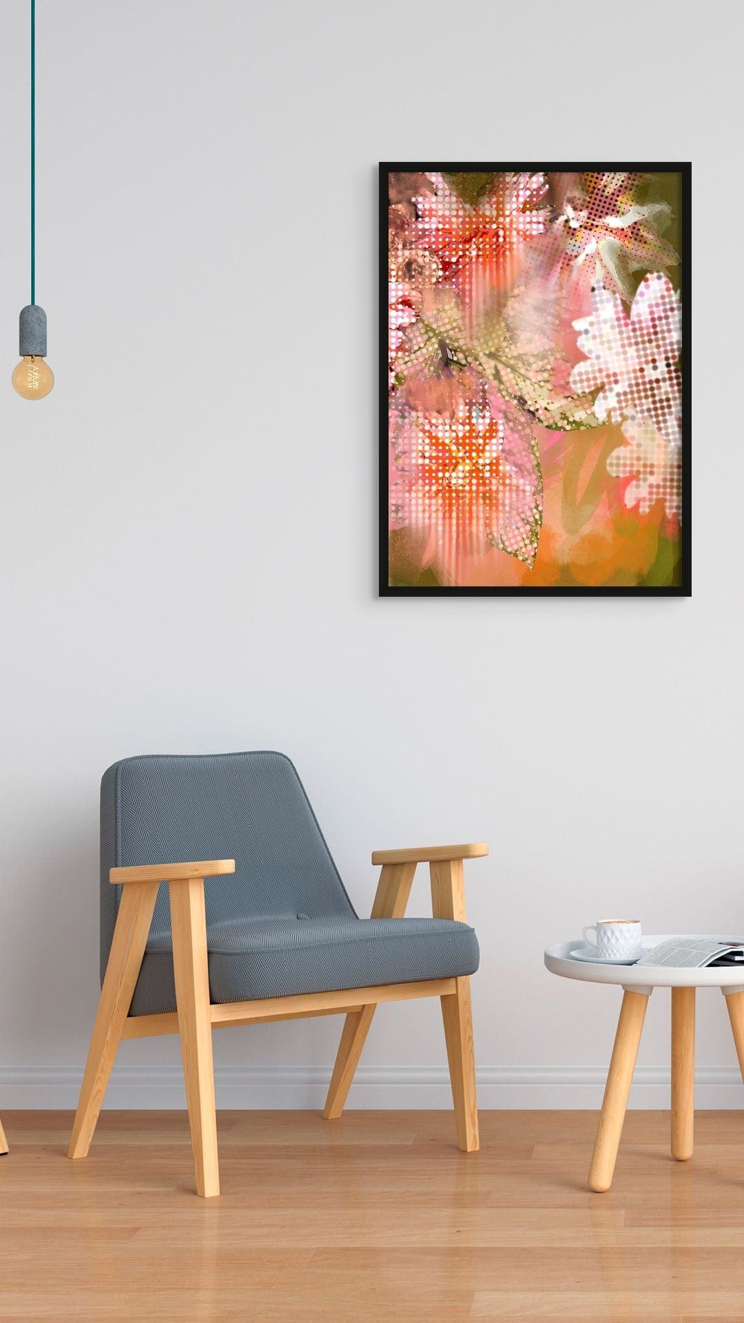
This artwork has an uplifting, cheerful vibe overall that could brighten a living room, bedroom, office or hallway. The warm colours would pair well with neutral furnishings or could pop against a crisp white wall.
The colours are reminiscent of the setting sun, and the polka dots and glitchiness suggest the heat and humidity of the air. The artwork would be a great addition to a home, as it would bring a sense of warmth and nostalgia. It would also be a great reminder of the beauty of summer, even as it comes to an end.
This whimsical, happy piece seems versatile enough to complement many interior design styles, from eclectic to contemporary, while injecting a splash of joyful colour and energy into a space. It’s a great choice for any room that could use an infusion of “heat” and vibrant charm.
I guess you like abstract art, so luckily we have more Abstract Wall Art for your perusal.
Warm coral-red, dusty rose, soft sage-green, creamy white, burnt orange, and earthy olive make up the dominant palette of this print – a distinctly warm, sun-baked range with soft botanical undertones running through it. Walls in terracotta, warm sand, or a deep dusty blush will draw out the coral and rose tones through analogous harmony, making the print feel settled and intentional rather than dropped in. For those who prefer contrast, a muted sage or soft olive-grey – picking up the cooler green notes already woven through the leaves – creates a quiet near-complementary tension that lets the warm reds and oranges glow. If the room calls for neutrality, a warm off-white with a peachy or biscuit undertone will hold the whole palette without competing. This print suits living rooms, creative studio spaces, or a hallway where something visually alive is welcome at eye level; the upward-reaching botanical forms feel particularly at home above a console or sideboard. In terms of style, it genuinely works within maximalist, eclectic, retro-pop, and contemporary botanical interiors – spaces that invite colour and energy rather than quiet them down. It belongs to the Polka Flora collection, where playful polka dots meet fragmented, pixelated floral forms for what the artist describes as "a joyous art fusion that dances on the right side of cheerful," and it pairs naturally with other prints from the collection for a gallery wall that reads as a cohesive series. It would make a considered gift for anyone who decorates boldly and finds joy in colour.
Printed on Enhanced Matte art paper using archival pigment inks, this is a smooth, gallery-grade stock with a soft, glare-free surface that art professionals would recognise as museum-grade quality; the absence of shine means it reads just as well under artificial light as in a bright room, and the matte finish sits comfortably inside both a slim modern frame and a chunkier vintage or ornate one. The A4 (21 × 29.7 cm) and A3 (29.7 × 42 cm) sizes suit shelf displays, grouped gallery walls, or smaller rooms where the print’s warmth and energy need a lighter touch; the A2 (42 × 59.4 cm) works as a confident standalone piece above a desk or bedside, while the A1 (59.4 × 84.1 cm) becomes a proper focal point on a main wall, and the A0 (84.1 × 118.9 cm) is large enough to anchor an entire room, filling the kind of wall space that a bold, colour-led composition like this fully deserves. This print is also available as a 28 × 40 inch (70 × 100 cm) canvas print, ready to hang with no frame needed.