Choose Your Print Size
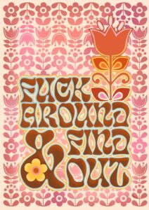
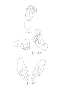
How should you live your life? You could look in your mirror every morning and chant how strong you are, or you could salute this print by your front door and make the decision for how you shall deal with the day. Zero Fucks Given.
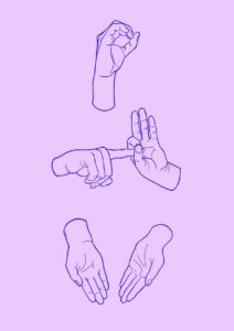
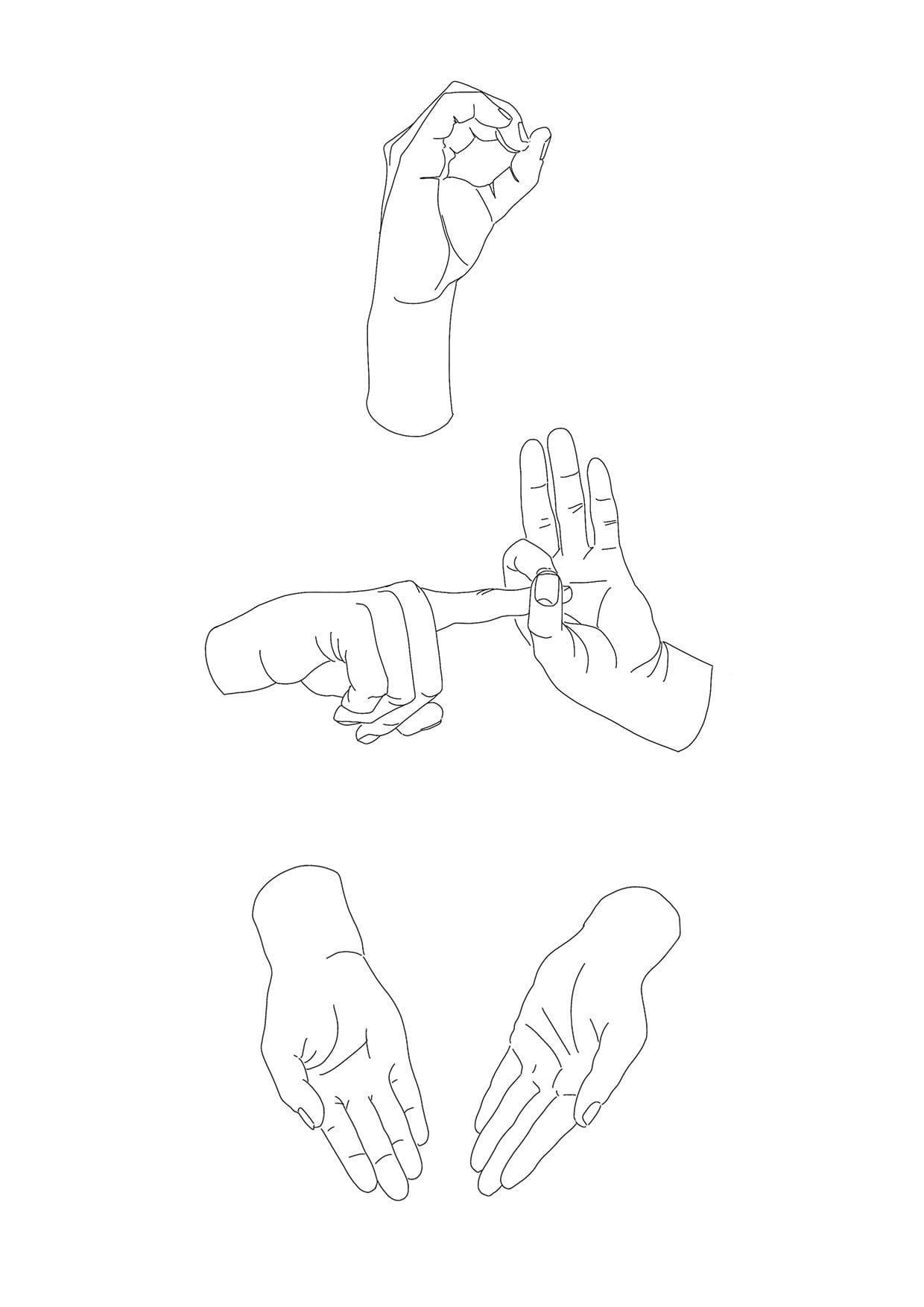
We have, entirely ironically, created this print based on our original Zero Fucks Given, but we’ve taken out the words. That way you can display it loudly and proudly but also keep it for your own amusement.
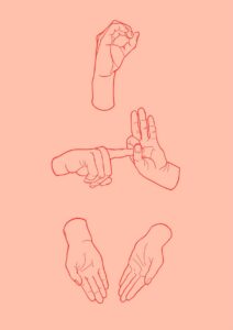
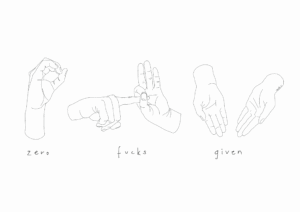
Due to demand we have created a number of versions of this print..same as this with a pink background, a lilac background, or with words, as well as the original which is in a landscape format.
The dominant palette here is stripped back to pure graphic contrast – crisp white paper, dense black line work, and the soft mid-grey of cast shadow – making this a print that behaves almost like a neutral in a room while still carrying real attitude. That cool, achromatic palette means it sits happily against walls in the same tonal family: a soft warm white with a barely-there yellow undertone will lift the paper tones; a cool pale grey-white reads as a tonal extension of the shadow marks themselves; a deep charcoal or near-black wall flips the contrast dramatically and lets the white space glow. For those who want a complementary push, the stark coolness of the line work holds its own against a muted dusty blush or a washed sage, where the warmth or softness of the wall makes the graphic precision of the drawing feel sharper by comparison. In terms of style, a stylist would reach for this in a minimalist interior, a contemporary monochrome scheme, a Scandi-influenced space, or a relaxed industrial loft – anywhere the design language runs clean and the decoration is chosen with purpose rather than volume. It suits a home office where it functions as a quiet personal declaration, or a bathroom shelf where its dry wit lands without demanding much space. Part of the Sweary Psalms collection – a body of work that pairs irreverent language with refined draughtsmanship – it hangs well alongside other prints from the series as a gallery wall that builds its own deadpan argument across the arrangement. It makes a considered gift for someone who appreciates art that is composed and cheeky in equal measure.
Printed using archival pigment inks on Enhanced Matte art paper – a smooth, gallery-grade stock with a soft, glare-free surface – the finish reads as genuinely museum-grade without any shine to compete with the precision of the line work. The matte surface suits both a slim modern metal frame and an ornate plaster or wood vintage frame equally well, since there is no glare to manage in either case. At A4, it fits a shelf stack or a tightly curated gallery wall; A3 holds its own in a cluster arrangement or a narrow hallway. The A2 steps up to a proper statement piece for a desk wall or bathroom, while A1 is the natural size for a home office or bedroom where the graphic confidence of the image benefits from room to breathe; A0 is a room-anchoring scale best reserved for generous walls in open-plan spaces or a studio. This print is also available as a 28×40 inch (70×100 cm) canvas, ready to hang with no frame needed.