Choose Your Print Size
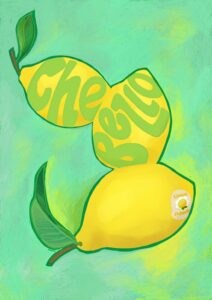
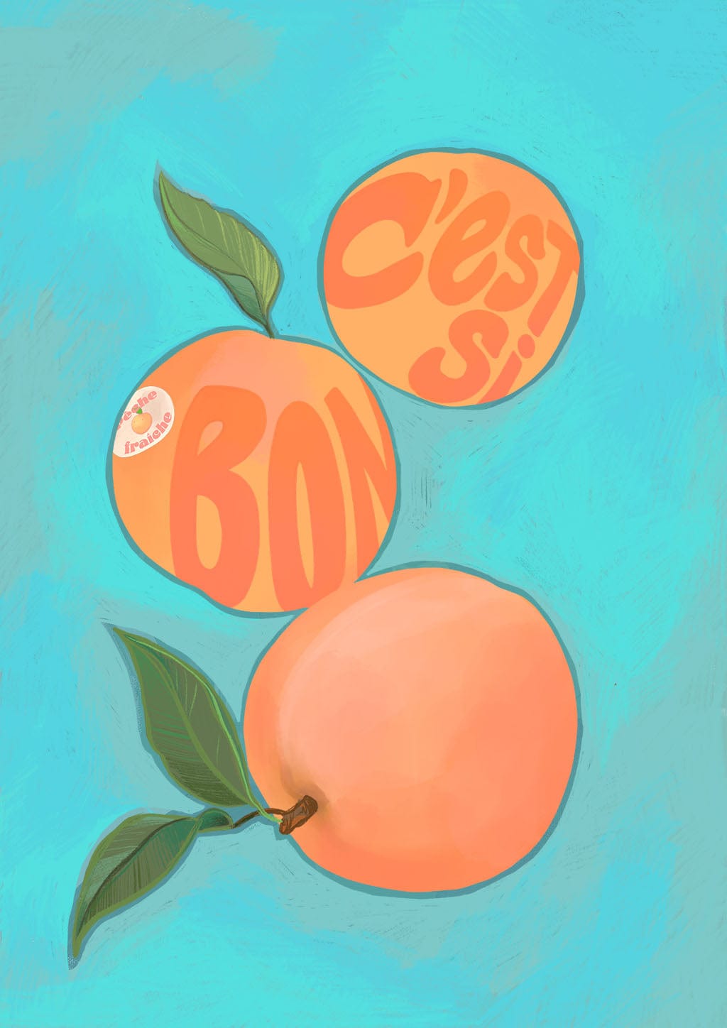
C’est si bon! It’s so good! Seductive french peaches. Velvety exterior with subtle sweet flavours, peaches exude a subtle elegance and style ….like an Edith Piaf song….but maybe that’s just me….
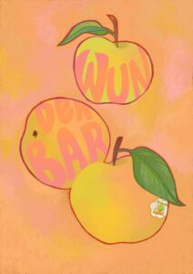
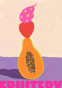
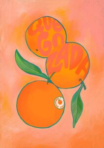
Intercontinental Fruitery brings you the finest crops from around the globe with regional expressions of delight. This series was created with kitchens and dining rooms in mind…..or anywhere else a bit of juiciness and zest are required! Beautiful as a set or larger individual statement pieces!
Peach flesh, coral-orange, warm aqua, teal, sage green and creamy yellow – those are the colours at work here, a palette that sits entirely on the warm side of cool, where the aqua background carries enough yellow in its undertones to stay friendly rather than icy. That warmth makes the print a natural partner for walls in soft terracotta or dusty salmon, analogous neighbours of the peach and coral tones that will draw the fruit forward without competition. For contrast, a muted teal or deep sea-green wall – pulling directly from the background hue of the print itself – gives a tonal, enveloping feel that works especially well in a dining room or kitchen. Warm white or soft linen walls suit it equally well, their yellow undertones echoing the creamy highlights on the fruit and keeping the whole arrangement sunny. The print belongs, above all, in a kitchen or dining room, where its subject matter feels genuinely at home; it would also lift a breakfast nook, a utility room with pretensions, or a garden-facing hallway. In terms of style, it sits comfortably in retro-modern, Mediterranean, Scandi-warm and contemporary maximalist interiors – anywhere colour is worn with confidence rather than caution. This print is part of the Intercontinental Fruitery collection on Diedododa, an effervescent series celebrating the vibrant beauty of fresh fruit with a love for naturally saturated colour and thoughtfully chosen typography; it pairs easily with other prints from the collection for a gallery wall that feels like a market stall in the best possible way. It would make a considered gift for anyone who takes their kitchen seriously, or for the friend who fills every room with colour and never apologises for it.
Printed using archival pigment inks on Hahnemühle Photo Rag® – a museum-grade, 100% cotton paper with a subtle felt texture – the surface is fully matte and glare-free, meaning it reads well in the bright conditions of a kitchen without needing specialist lighting, and it sits happily behind both slim modern frames and ornate vintage ones without the surface competing. The A4 suits a shelf arrangement or a tightly curated gallery wall where the typography can be appreciated up close; the A3 holds its own as a standalone piece above a worktop or beside a dresser. The A2 and A1 sizes work as genuine statement pieces – the kind that give a dining room its character – while the A0, at 84.1 × 118.9 cm, is large enough to anchor a full wall and let the aqua background read as a colour in the room rather than just in the frame. This print is also available as a 28 × 40 inch (70 × 100 cm) canvas, ready to hang with no frame needed.