Choose Your Print Size
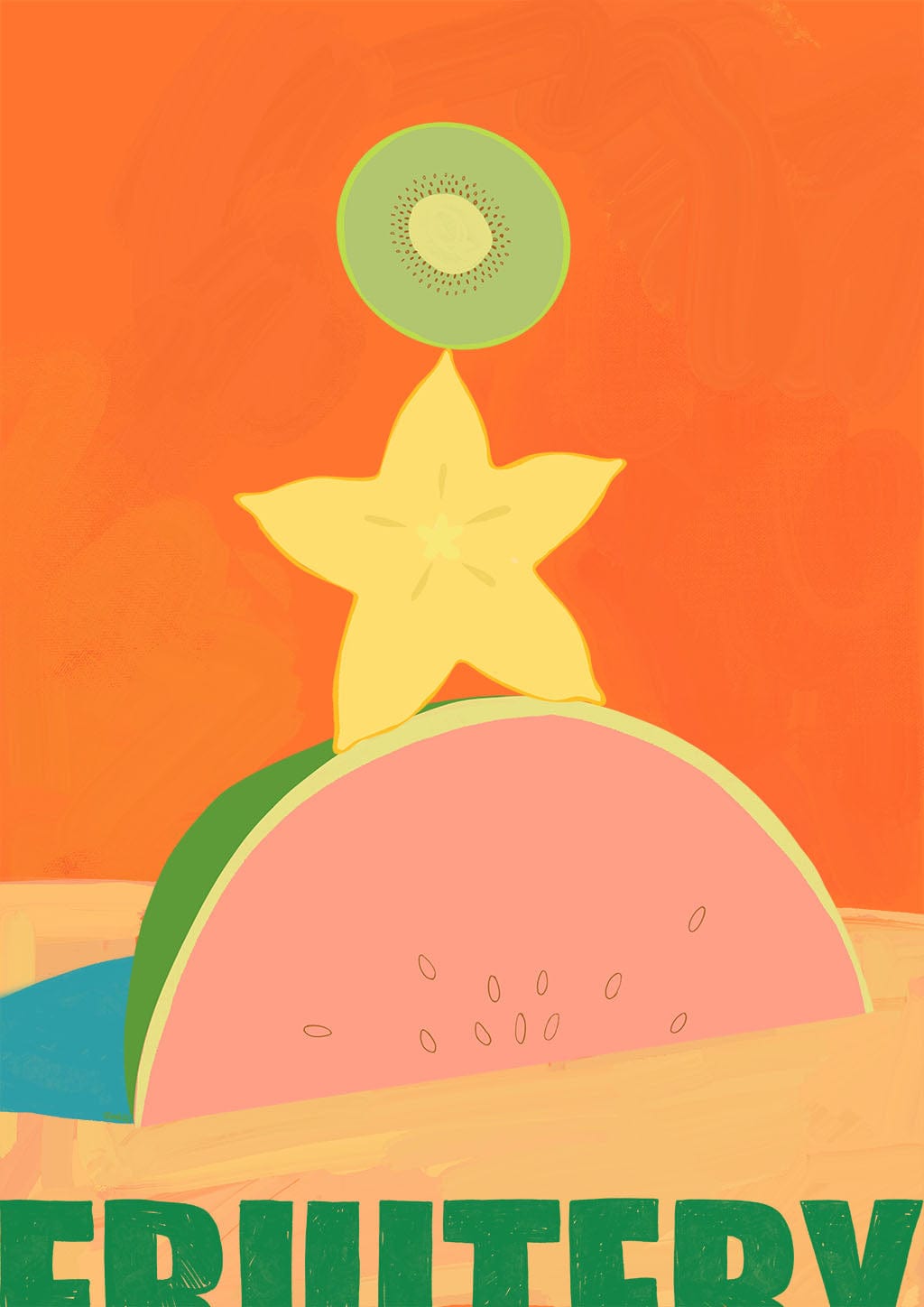
Watermelon, Starfruit, Kiwi
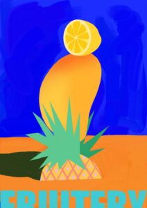
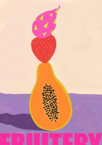
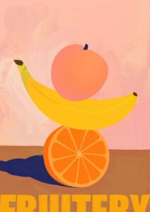
Fruitery Totems are a tropical balancing act of cheerful fresh fruit. Part of the Intercontinental Fruitery series that was inspired by a love of naturally saturated fruit colours paired with typography….and my own frustration at not being able to find the right fruit themed artwork for my own kitchen 😉
Burnt orange dominates this print with an intensity that fills the room before anything else registers – then the eye settles into lime green, soft watermelon pink, pale yellow, and a small flash of teal at the lower edge. The palette runs warm throughout, which makes it a natural companion for walls in terracotta, warm ochre, or a deep rust that echoes the background directly. For a softer tonal scheme, a sandy or pale peach wall lets the orange recede gently without losing its warmth. If you want the green to do the talking, a warm sage or muted olive wall works on an analogous relationship with the lime and watermelon rind, grounding the composition without competing with it.
The graphic flatness, bold silhouettes, and playful stacking arrangement sit comfortably within mid-century modern and contemporary maximalist interiors, and the fruit-market exuberance gives it a natural home in retro kitchen styling or a bold eclectic scheme. It is an obvious fit for a kitchen or dining room, where the subject matter earns its place, but the scale and confidence of the composition mean it works equally well as a statement piece in a hallway or a child’s playroom.
This print belongs to the Intercontinental Fruitery collection, an effervescent series celebrating the naturally saturated colours of fresh fruit paired with thoughtfully chosen typography – a joyous, design-led response to nature’s bounty that is as much about colour and whimsy as it is about the fruit itself.
The canvas version is a large 28×40 inch (70×100 cm) print mounted on a pine frame and arrives ready to hang with no external frame needed. The same design is also available on art paper in five sizes – A4, A3, A2, A1, and A0 – for those who prefer a smaller scale or a framed presentation.
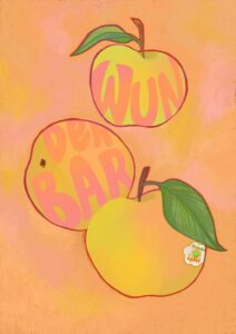
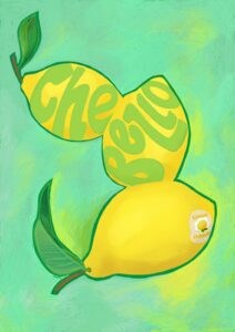
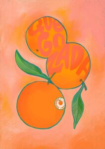
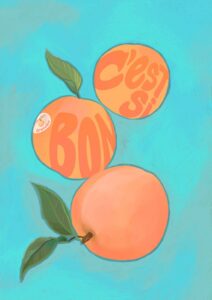
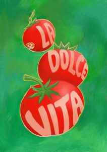
Ah, how utterly refreshing! Welcome to my ‘Intercontinental Fruitery’ collection on Diedododa, an effervescent series of art prints celebrating the vibrant beauty of fresh fruit. This delightful collection was inspired by my love for the naturally saturated colours of fruit and an appreciation for typography. Plus, if I may add, a dash of personal frustration at not being able to find just the right fruit-themed artwork for my own kitchen.
Each print in the collection features a charming depiction of a different fruit. From the tangy allure of citrus to the soft sweetness of berries, these prints capture the natural vibrancy of these delectable wonders in an elegant and playful manner. The artworks are paired with thoughtfully chosen typography, creating a delightful interplay between the text and the vivid imagery.
The ‘Intercontinental Fruitery’ series is a joyous celebration of nature’s bounty, infused with a love for design and colour. The prints not only add a cheerful splash of colour to your space but also a touch of whimsy and fun. Whether you’re a food lover, a fan of colourful art, or simply on the hunt for the perfect kitchen decor, this collection is a tantalising treat. Come, join me in celebrating the beauty of fresh fruit, one colourful print at a time.