

Choose Your Print Size
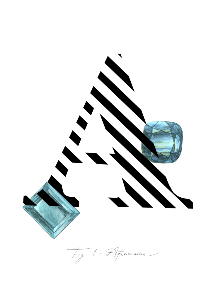
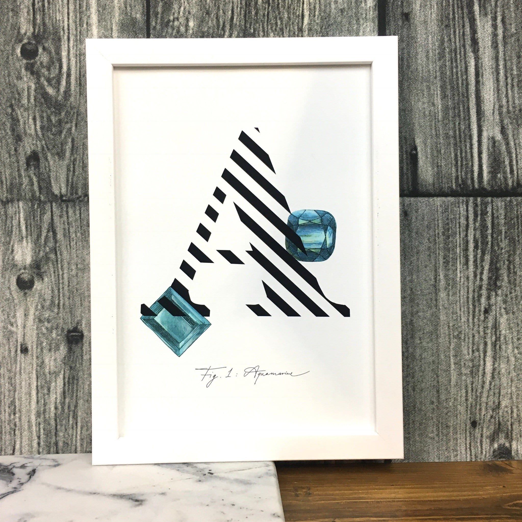
A is for Aquamarine.
The characteristic light turquoise blue coloured stone is a type of Beryl. Aquamarine literally means seawater. In folklore it is said that aquamarine gives the wearer protection against foes in battle or litigation. It also makes the wearer unconquerable and amicable, and quickens the intellect.
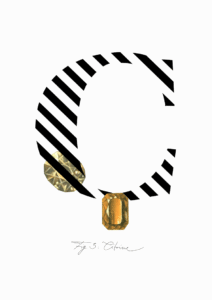
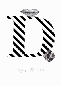
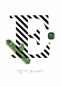
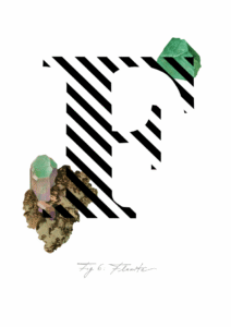
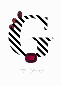
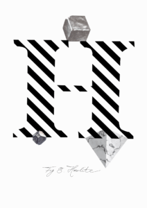
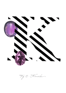
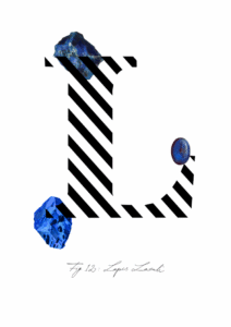
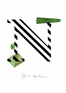
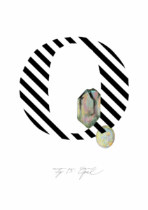
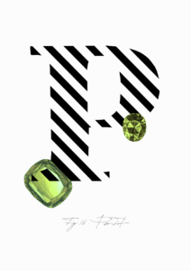
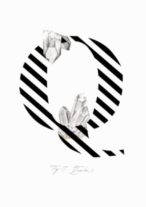
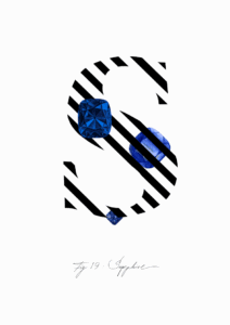
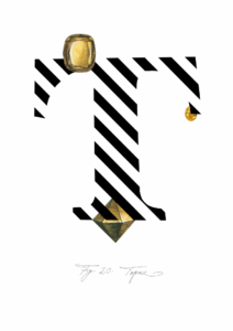
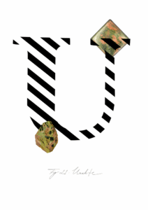
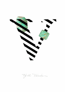
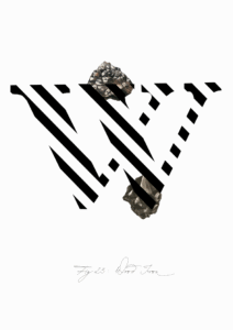
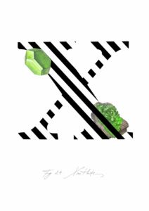
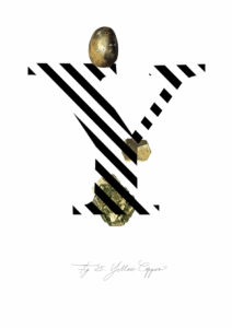
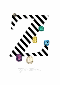
The Gemstone Alphabet combines a minimalist aesthetic of bold striped initial letters with geometrically striking and unusual gemstones and minerals. Science..but sexy!
Cool aquamarine and slate blue sit at the heart of this print, their watery, slightly grey-green undertones giving the palette a calm, mineral quality. The bold black-and-white diagonal stripes of the letterform pull the composition into sharp graphic contrast, while the two illustrated gemstones – one a faceted cushion cut, one a step-cut square – introduce a soft metallic pencil-grey in their hatched facets and the faintest hint of pale chartreuse in their depths. Because the dominant hues are cool and blue-leaning, walls in soft white with a cool, barely-there blue or grey undertone let the aquamarine read cleanly without competition; a deeper slate or stormy blue-grey on the wall creates a tonal, enveloping scheme by drawing out the cooler shadows within the gems themselves. For a complementary lift, a warm terracotta or dusty coral wall works by contrast – the orange-adjacent warmth sits directly opposite the blue on the colour wheel and makes the gemstones glow. This is a print that a stylist would reach for in a contemporary graphic interior, an art deco-influenced room, a modern maximalist scheme where bold type and jewel tones coexist, or a cool Scandinavian-minimal space that wants a single considered focal point. It suits a home study, a dressing room, or a hallway where the jewellery subject feels purposeful. Part of the Gemstone Alphabet collection – a series pairing illustrated precious stones with bold letterforms – it pairs naturally with other prints from the collection for an A-to-Z gallery wall. It makes a considered gift for anyone with a love of jewellery, design, or the letter A.
The print is produced with archival pigment inks on Enhanced Matte art paper, a smooth gallery-grade stock with a soft, glare-free surface that a stylist would honestly call museum-grade – and that finish works equally well behind a slim black or brass frame and under the glass of a more ornate gilded mount. At A4 (21 × 29.7 cm) it sits well on a shelf or contributes to a layered gallery wall; at A3 (29.7 × 42 cm) it holds its own as a desk or bedside statement; at A2 (42 × 59 cm) the diagonal stripes and gem illustrations command a wall properly; and at A1 (59.4 × 84.1 cm) the graphic letterform becomes a room-anchoring piece with genuine presence. This print is also available as a 28 × 40 inch (70 × 100 cm) canvas print, ready to hang with no frame needed.