Choose Your Print Size
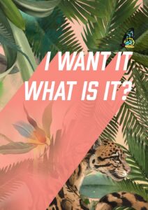
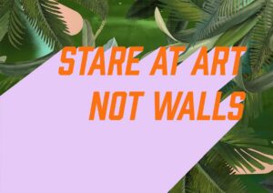
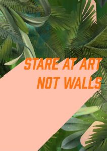
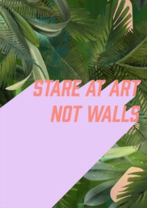
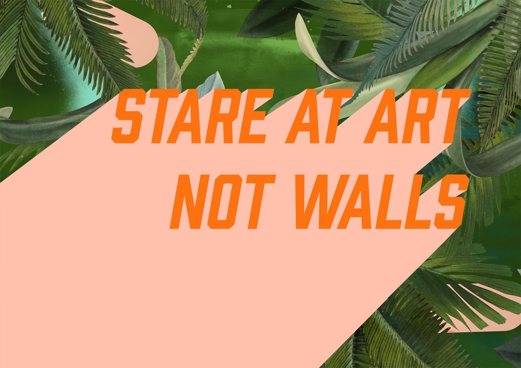
For lovers of typography prints – this is my motto, boldly set in pastel colours against the sumptuous Fougere Fou design.
What does it mean though? Well, the idea is that what you surround yourself with should always truly be loved by you and inspire you.
Art brings a space to life like nothing else in your home. It has the power to inspire emotions, provoke thoughts, and convey your personality.
With that in mind, always choose pieces that truly speak to you. As with everything, art trends can seem tempting to follow; I’d advise to use them as a serving suggestion, rather than a full recipe…
Warm salmon-pink, burnt orange, deep jungle green, soft mint and pale cream are the colours doing the work here – a palette that runs warm overall, with the greens carrying just enough cool undertone to keep things lively rather than stuffy. That warmth makes it a natural companion to walls painted in terracotta, dusty blush or a soft ochre-tinged white, all of which draw out the coral and orange without competing. If you want a little contrast, a deep muted sage or bottle-green wall will mirror the foliage and let the pink diagonal cut through it with real confidence. The mood is bold but botanical – playful enough for a maximalist living room or a creative studio, grounded enough for a kitchen or a hallway that needs a jolt of personality. It sits most naturally within tropical maximalist, contemporary graphic, eclectic bohemian and modern retro interiors – anywhere that welcomes pattern, colour and a degree of irreverence. The typographic declaration makes it a statement above a desk or pinboard, while the landscape format is ideal above a sofa or sideboard where a horizontal anchor is needed. It belongs to the Stare At Art collection, a range built around the simple, satisfying idea that walls deserve to be looked at – and it pairs readily with other prints from the collection to build a gallery wall with a consistent wit and energy. For a friend who has been talking about finally doing something with their walls, it makes an honest, specific gift.
Printed with archival pigment inks on Enhanced Matte art paper – a smooth, gallery-grade stock with a soft, glare-free surface that a stylist might describe as museum-grade without any stretch – this print works equally well in a slim white or natural-wood frame and in something heavier and more ornate, since the matte finish eliminates the glare that catches on glass in either. At A4 it slips onto a shelf or into a gallery-wall arrangement without dominating; A3 holds its own as a single piece in a smaller room. A2 brings the orange typography into proper focus from across the space, while A1 is confident enough to anchor a living room or studio wall on its own. At A0, the full 84.1 × 118.9 cm sheet turns a blank wall into something you actually look at – which, given the title, feels about right. This print is also available as a 28×40" (70×100 cm) canvas, ready to hang with no frame needed.