Choose Your Print Size
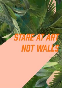
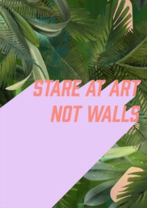
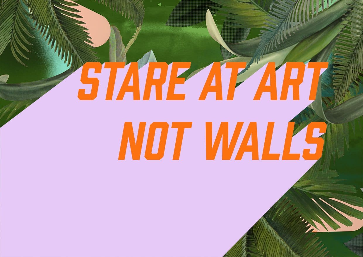
For lovers of typography prints – this is my motto, boldly set in pastel colours against the sumptuous Fougere Fou design.
What does it mean though? Well, the idea is that what you surround yourself with should always truly be loved by you and inspire you.
Art brings a space to life like nothing else in your home. It has the power to inspire emotions, provoke thoughts, and convey your personality.
With that in mind, always choose pieces that truly speak to you. As with everything, art trends can seem tempting to follow; I’d advise to use them as a serving suggestion, rather than a full recipe…
Lavender purple, vivid orange, and several shades of deep jungle green are the colours doing the heavy lifting here, with softer blush pink and warm cream appearing in the tropical foliage as accents. The palette runs warm overall – the orange is hot and saturated, and even the purple leans slightly red rather than blue – which makes it sing against walls painted in a warm off-white or a soft ochre-adjacent cream, both of which echo the blush tones already woven through the leaves. For something with more presence, a deep forest green or a muted sage wall creates an analogous, immersive relationship with the botanical illustration, drawing the eye straight to the orange type. Those who prefer contrast could try a warm terracotta or dusty burnt-apricot tone, which picks up the orange lettering and the pink highlights without fighting the purple. In terms of style, this print sits naturally in maximalist, tropical or botanical interiors, and in the kind of bold graphic pop-art spaces that treat typography as decoration – it would also read well in a playful, confident contemporary home that layers pattern freely. The kitchen, a home studio, a creative workspace, or a teenager’s bedroom are all rooms where its energy lands well, particularly on a wall with clear sightlines rather than tucked into a corner. Part of the Stare At Art collection, which takes the unapologetic position that living with art is simply better than living without it, this print pairs naturally with other pieces from the collection for a gallery wall that feels more like a manifesto than an arrangement. It makes a genuinely good gift for a housewarmer, an art-lover, or anyone who has recently moved into a first home.
Printed on Enhanced Matte art paper using archival pigment inks, this is a smooth, gallery-grade stock with a soft, glare-free surface that reads as quietly serious without drawing attention to itself – museum-grade quality that lets the image, not the finish, do the talking. The matte surface works equally well in a slim black or natural oak frame and in an ornate plaster or gilded vintage frame, since there is no sheen to compete with either. At A4 the print is ideal for a shelf lean, a pinboard, or a gap in a gallery wall; A3 and A2 bring enough weight to hold their own as a focused feature above a desk or beside a door; A1 makes a proper statement on a wide wall, and A0, at 84.1 × 118.9 cm, is large enough to anchor an entire room and carry the bold type at full impact. This print is also available as a ready-to-hang canvas print at 28 × 40 inches (70 × 100 cm), requiring no frame.