

Choose Your Print Size
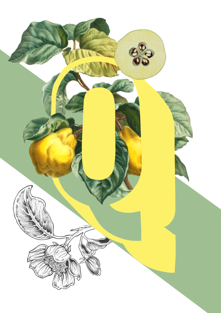
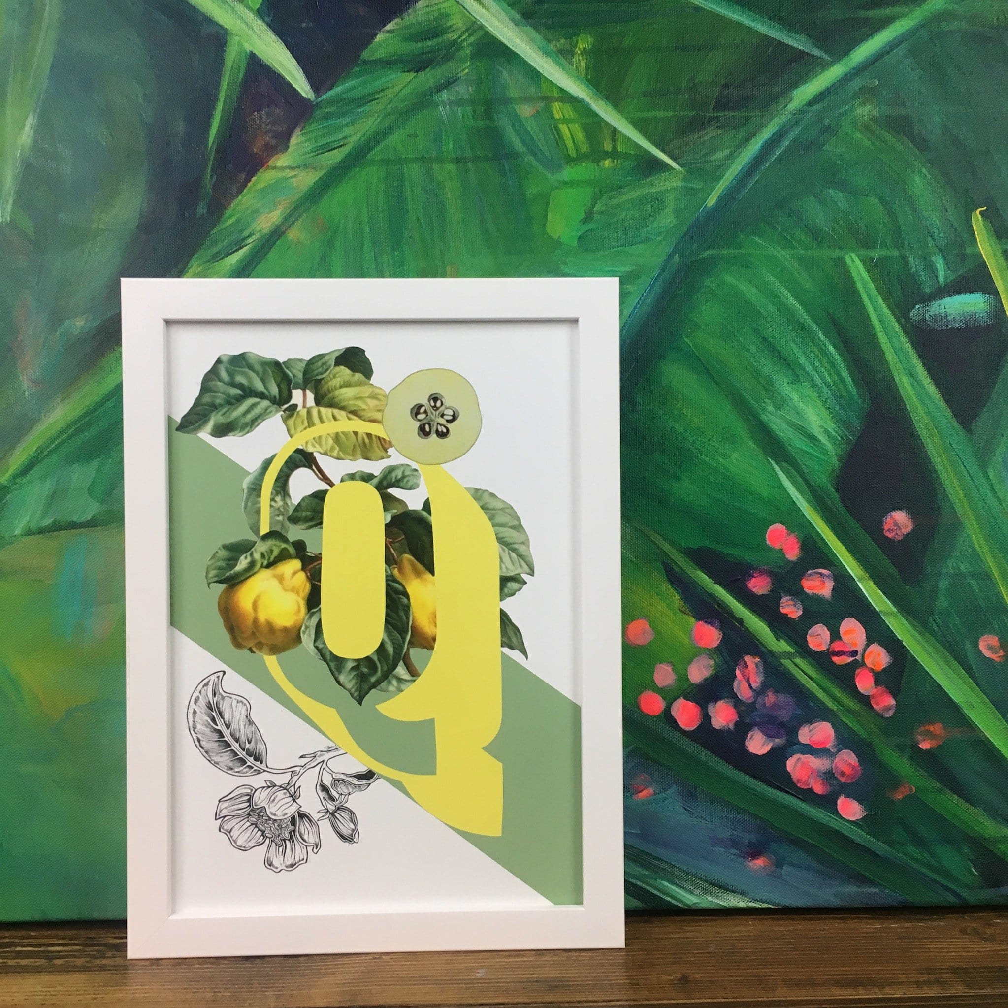
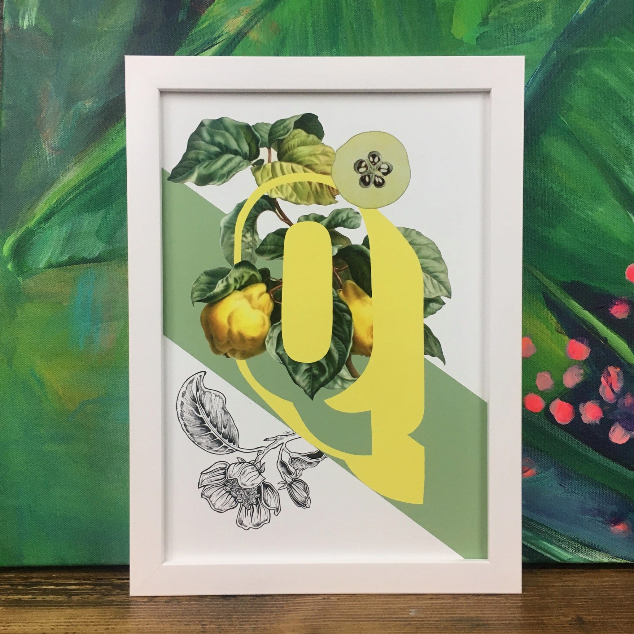
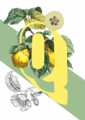
Q is for Quince.
The quince fruit is a striking yellow colour colour and while some species can be eaten raw most require some form of cooking. It is incredibly versatile and can be turned into jelly, drinks and even “quince cheese” which is not cheese at all but a hard paste in loaf shape with subtle grainy and sweet texture and a great accompaniment to a cheese board. The quince is one of the oldest fruits to be associated with fertility and love.
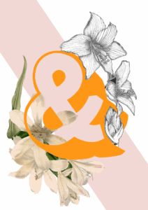
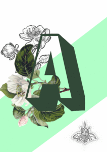
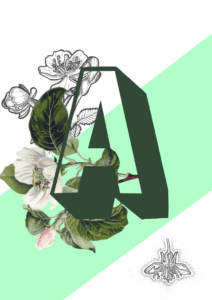
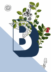
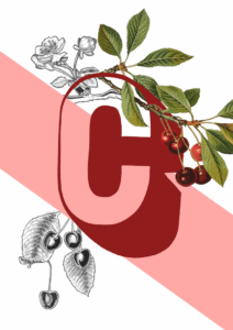
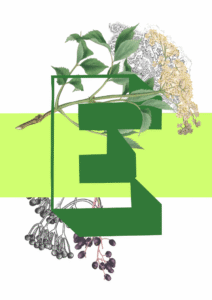
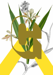
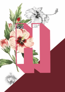
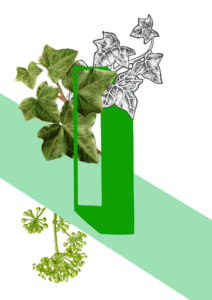
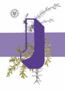
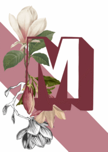
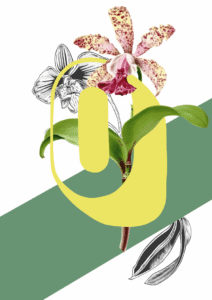
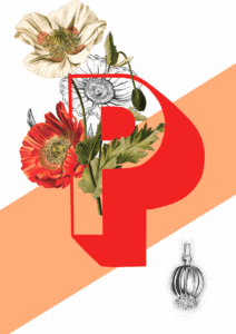
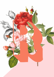
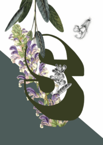
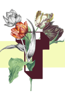
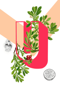
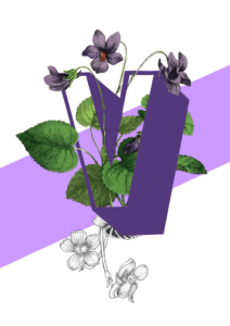
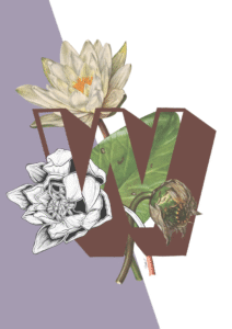
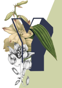
The Botanical Alphabet is inspired by old scientific botanical illustrations and categories of olden day Explorers and Naturists. Paired with modern outlined sans serif letters and bold colour blocks, it has a much more contemporary feel while still keeping a hint of the much loved illustration genre of the past.
The Botanical Alphabet series is also available as greeting cards, so you can send a very personal card for any occasion featuring your friend’s initial.
Warm sage green, soft butter yellow, and deep forest green form the backbone of this print’s palette, with small accents of ivory, pale apple flesh, and warm brown threading through the botanical detail. Those hues run cool-to-neutral with earthy, yellow-leaning undertones, which means the print feels at ease against walls in the same sage-to-olive family – an analogous harmony that lets the yellow letter glow without fighting the background. For contrast, a warm terracotta or dusty burnt-orange wall draws out the brown stems and makes the yellow pop through near-complementary tension. Prefer something quieter? A warm off-white with a faint green or yellow undertone – the kind that reads almost like fresh cream in daylight – keeps the composition calm and the botanicals front and centre. This is a print for kitchens, where the quince’s domestic, preserve-jar warmth feels exactly right, but it works equally well in a study, a dining room, or a calm bedroom corner. Stylistically it sits comfortably in botanical maximalist, Scandi-natural, and modern heritage interiors, and it would not look out of place in a curated cottagecore scheme either. It belongs to the Botanical Alphabet collection – a series that pairs vintage scientific illustration with bold modern typography and vibrant colour-blocked backgrounds – and it groups naturally with other letters from the collection on a gallery wall. A considered gift for a gardener, a naturalist, or anyone whose name or home begins with Q.
The print is produced with archival pigment inks on Enhanced Matte art paper, a smooth gallery-grade stock with a soft, glare-free surface; Enhanced Matte art paper is worth naming because it sits in the museum-grade category, delivering rich, even colour without the distracting reflections of a gloss finish. That matte surface suits both slim, pale wood frames and more ornate gilded or dark-stained mouldings – the sage and cream tones in the image are forgiving partners for either. At A4 (21 × 29.7 cm) or A3 (29.7 × 42 cm) the print is well suited to a shelf, a bedside ledge, or a tightly composed gallery wall alongside other letters from the collection. A2 (42 × 59.4 cm) gives the botanical illustration and oversized yellow Q enough room to breathe as a standalone piece above a desk or kitchen counter, while A1 (59.4 × 84.1 cm) has the presence to anchor a full wall in a dining room or hallway. This print is also available as a ready-to-hang canvas in 28 × 40 inches (70 × 100 cm), requiring no frame.