


Choose Your Print Size
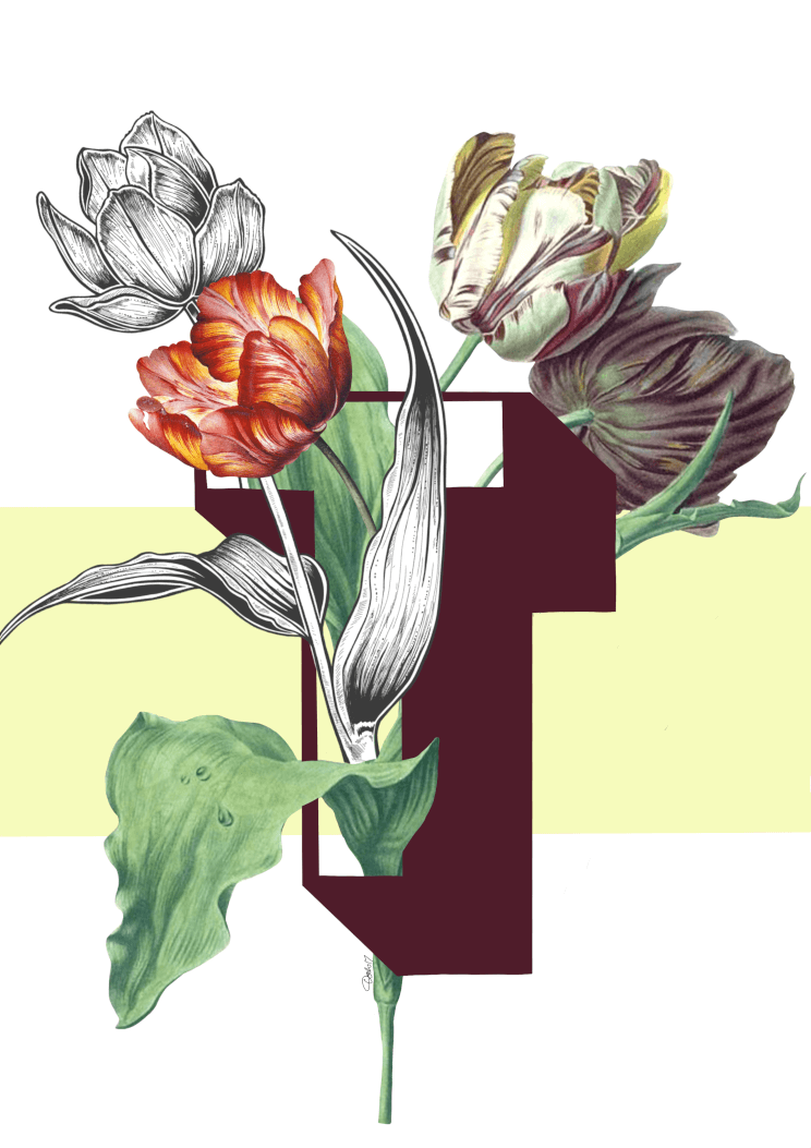
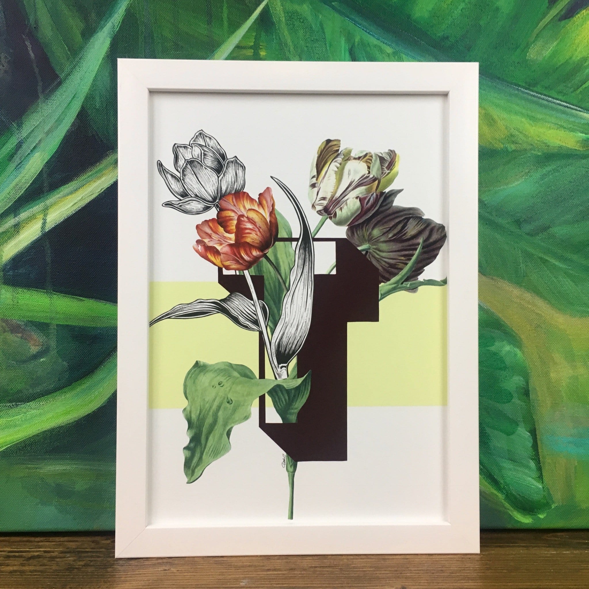
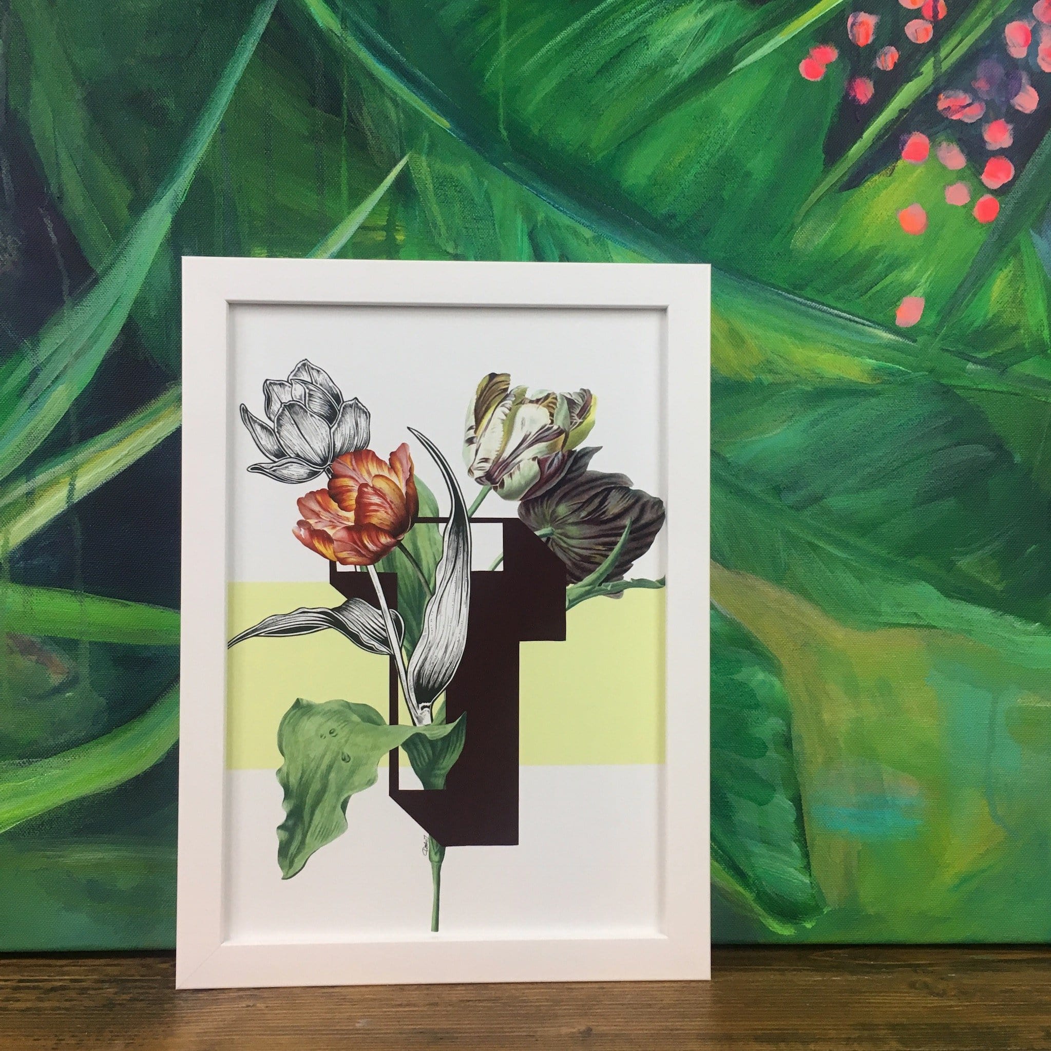
T is for Tulip.
Synonymous with Dutch tulip fields and windmills, tulip cultivation started in Persia in the 10th century. Tulip petals are edible while the bulbs are not recommended and very possibly toxic to some level. In Victorian floriography the meaning of tulips depends on colour. White: I am worthy of you Red: declaration of love Variegated: you have beautiful eyes Yellow: there is sunshine in your smile.
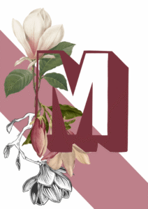
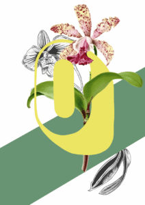
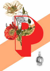
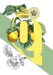
The Botanical Alphabet is inspired by old scientific botanical illustrations and categories of olden day Explorers and Naturists. Paired with modern outlined sans serif letters and bold colour blocks, it has a much more contemporary feel while still keeping a hint of the much loved illustration genre of the past.
The Botanical Alphabet series is also available as greeting cards, so you can send a very personal card for any occasion featuring your friend’s initial.
Tulip T carries a palette of deep burgundy, burnt orange, warm ivory, olive green, and soft black-and-white line work against a pale lemon-yellow band – a combination that reads as simultaneously warm and botanical, with earthy undertones pulling every element together. That deep burgundy anchors the composition, so walls painted in the same family – rich plum, dusty rose, or a muted terracotta – create a tonal, enveloping scheme where the print feels at home rather than imposed. The pale lemon yellow of the colour block suggests a brighter analogous option: warm butter or soft ochre walls that echo it directly while letting the burnt orange tulip ignite the arrangement. Cooler neutrals work too, provided they carry a warm undertone – think greige or linen rather than blue-toned grey, which would flatten the print’s inherent warmth. In terms of style, this print genuinely suits maximalist-botanical, modern-vintage, contemporary-eclectic, and traditional-with-a-twist interiors – spaces where old and new are allowed to converse. It belongs in a study, a dining room, or a bedroom where something layered and considered is wanted on the wall; a hallway grouping would suit it equally well. Tulip T sits within the Botanical Alphabet collection, a series that fuses vintage scientific illustration with bold modern typography – each print "a love letter to nature, to typography, and to art" – and pairs naturally with other letters from the collection to build a gallery wall that spells initials, a name, or simply accumulates beautifully. It is a considered gift for anyone with a fondness for botanical history, natural history illustration, or simply an eye for intelligent, stylish design.
The print is produced with archival pigment inks on Enhanced Matte art paper, a smooth gallery-grade stock with a soft, glare-free surface that eliminates reflections and keeps every fine line of the illustration crisp at any viewing angle – museum-grade quality without clinical coldness. That matte finish is equally at home behind a slim black or brass modern frame as it is within a deeper, more ornate vintage moulding, making it one of the more versatile prints in the Botanical Alphabet collection to frame. At A4 it sits confidently on a shelf or as part of a tightly curated gallery wall; A3 holds its own as a desk focal point or within a mid-sized arrangement. Step up to A2 and the botanical detail and bold letter earn real presence above a console or fireplace, while A1 carries enough scale and drama to anchor a full dining-room or bedroom wall. For those who prefer to hang without framing, this print is also available as a ready-to-hang canvas print at 28×40 inches (70×100 cm).