Choose Your Print Size
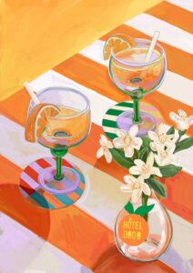
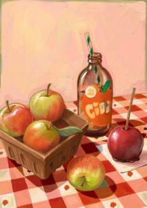
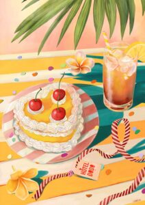
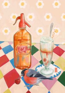
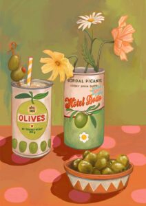
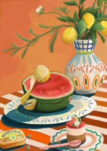
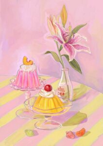
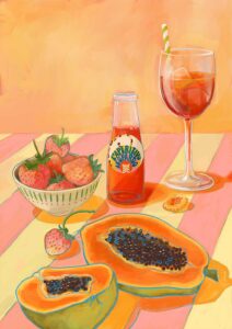
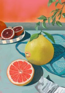
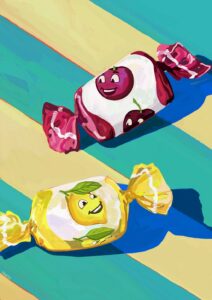
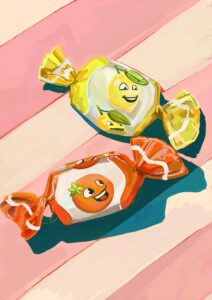
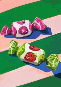
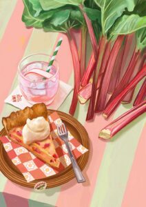
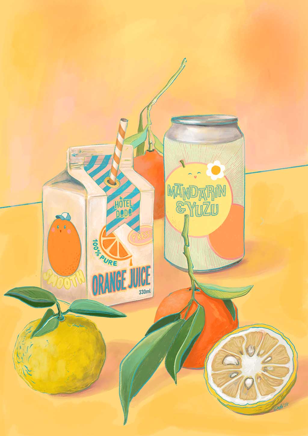
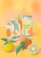
Funnily enough this one was inspired by the info that a certain chewing gum of the same name was being discontinued forever. There’s no gum in the picture but the sunshine yellow hues pay tribute to the product’s packaging….thinking of Juicy Fruit gum made me reminisce about childhood summers where juice boxes and fizzy drinks were a rare treat.
As you can probably tell I always liked the orange and citrus varieties. Although at the time they would’ve been limited to straight up orange or lemon! Well, not anymore because this is Hôtel Dodo where anything is possible after all 😉
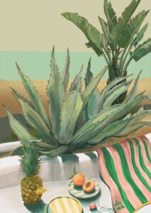
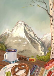
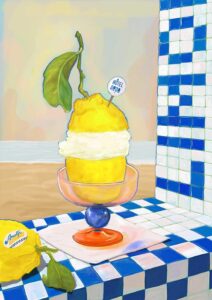
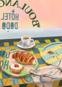
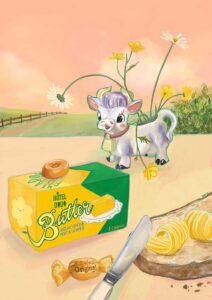
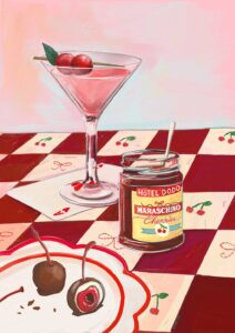
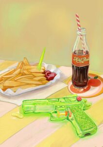
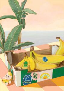
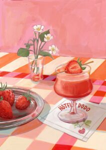
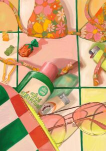
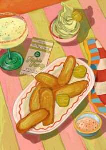
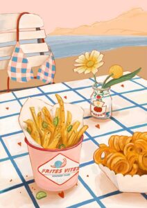
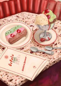
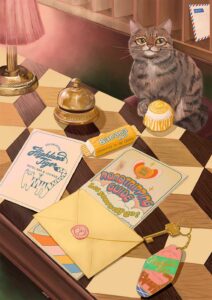
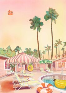
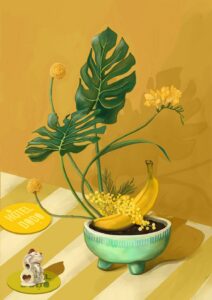
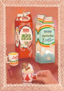
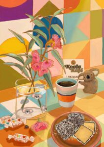
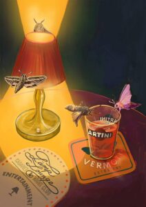
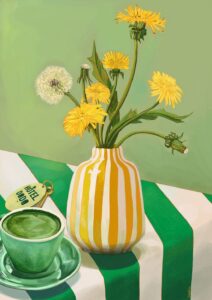
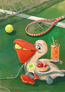
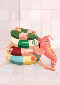
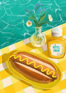
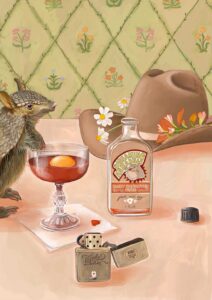
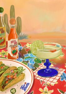
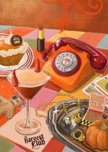
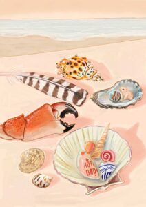
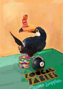
Hôtel Dodo is a place, or better a tiny universe, that exists in my head allowing me to mind travel. Not dissimilar to the concept of a mind palace that makes remembering things easier.
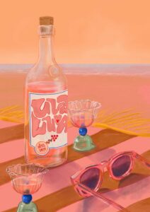
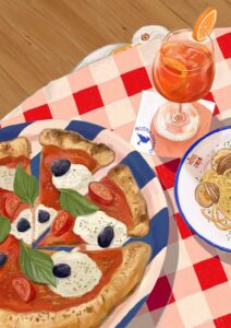
My little universe is all about moments of calm, appreciating the little things, sun soaked lazy holiday lunches, beautifully curated table settings, and overall that “nothing to do, nowhere to go” energy.
Each setting invites the viewer to take a seat and the table, focus on the calm before them and be transported elsewhere for a little while.
See you in the gift shop at Hôtel Dodo! X
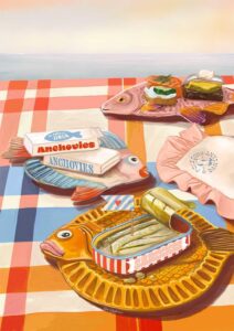
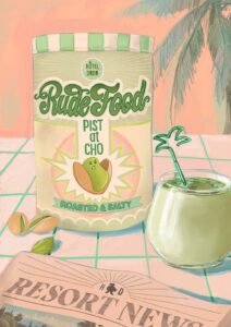
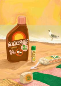
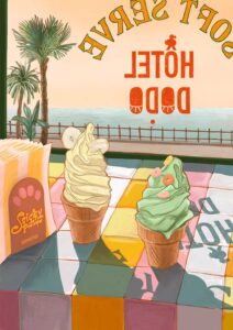
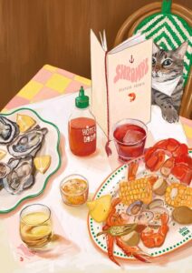
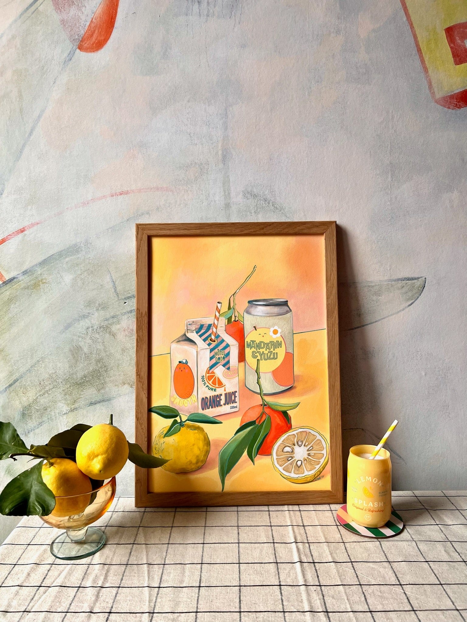
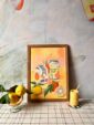
Warm mandarin orange, soft butter yellow, sage and mint green, dusty peachy pink, and chalky cream run through this print like a table set for a leisurely summer lunch – and those colours do most of the decorating work for you. Because the palette sits entirely in the warm half of the wheel, it sings against walls painted in a deeper terracotta or burnt amber (analogous neighbours that draw out the orange without competing), and it settles just as comfortably against warm white or an oat-toned neutral whose yellow undertone echoes the buttery background. For contrast, a muted sage or eucalyptus green – pulling directly from the leaf stems and the can’s celadon label – gives the print a fresh, considered edge against a wall painted in that same dusty mid-green. In terms of style, a stylist would reach for this print in a retro-inflected kitchen or dining room, a laid-back coastal space, or a room leaning into soft maximalism, and it works equally well in a cheerful Scandi-influenced scheme where playful illustration meets pared-back furniture. As part of the Hôtel Dodo collection – an imaginary resort built around retro holiday nostalgia and that enviable "nothing to do, nowhere to go" energy – it pairs naturally with other prints from the range for a sun-soaked gallery wall. It makes a genuinely lovely gift for citrus lovers, keen home cooks, or anyone whose kitchen needs a little poolside calm.
Printed on Hahnemühle Photo Rag®, a museum-grade cotton paper with a subtle felt texture, the image is rendered in archival pigment inks that hold the warmth of those mandarin and butter tones without any glare – meaning the matte surface reads just as well under kitchen spotlights as in soft natural light, and the finish suits everything from a slim brushed-brass frame to a chunky white vintage mount. At A4 (21 × 29.7 cm) or A3 (29.7 × 42 cm) the print slots neatly onto a shelf, into a gallery wall arrangement, or above a kitchen counter; at A2 (42 × 59.4 cm) or A1 (59.4 × 84.1 cm) it becomes a proper focal point above a dining table or sideboard; and at A0 (84.1 × 118.9 cm) it anchors an entire wall with the easy confidence of a resort mural. This design is also available as a 28 × 40 inch (70 × 100 cm) canvas print, ready to hang with no frame needed.