





Choose Your Print Size
The humble tomato. Inoffensive flavourer of condiments. Staple yet often under-appreciated carrier of dishes. Who knew it had such a dark past! You lost me, what?!….ok, so here goes:
Way, way back in the olden days, when they used to burn witches and all, tomatoes had a very bad rep. Deemed to be poisonous because the plant is part of the nightshade family. The same nightshade family that THE Deadly Nightshade (aka Belladonna) belongs to. The latter had very strong associations with witchcraft and the devil himself at the time, so by relation tomatoes were also absolutely not to be trusted. It took a couple of hundred years to get the lovely tomato out of its bad reputation.
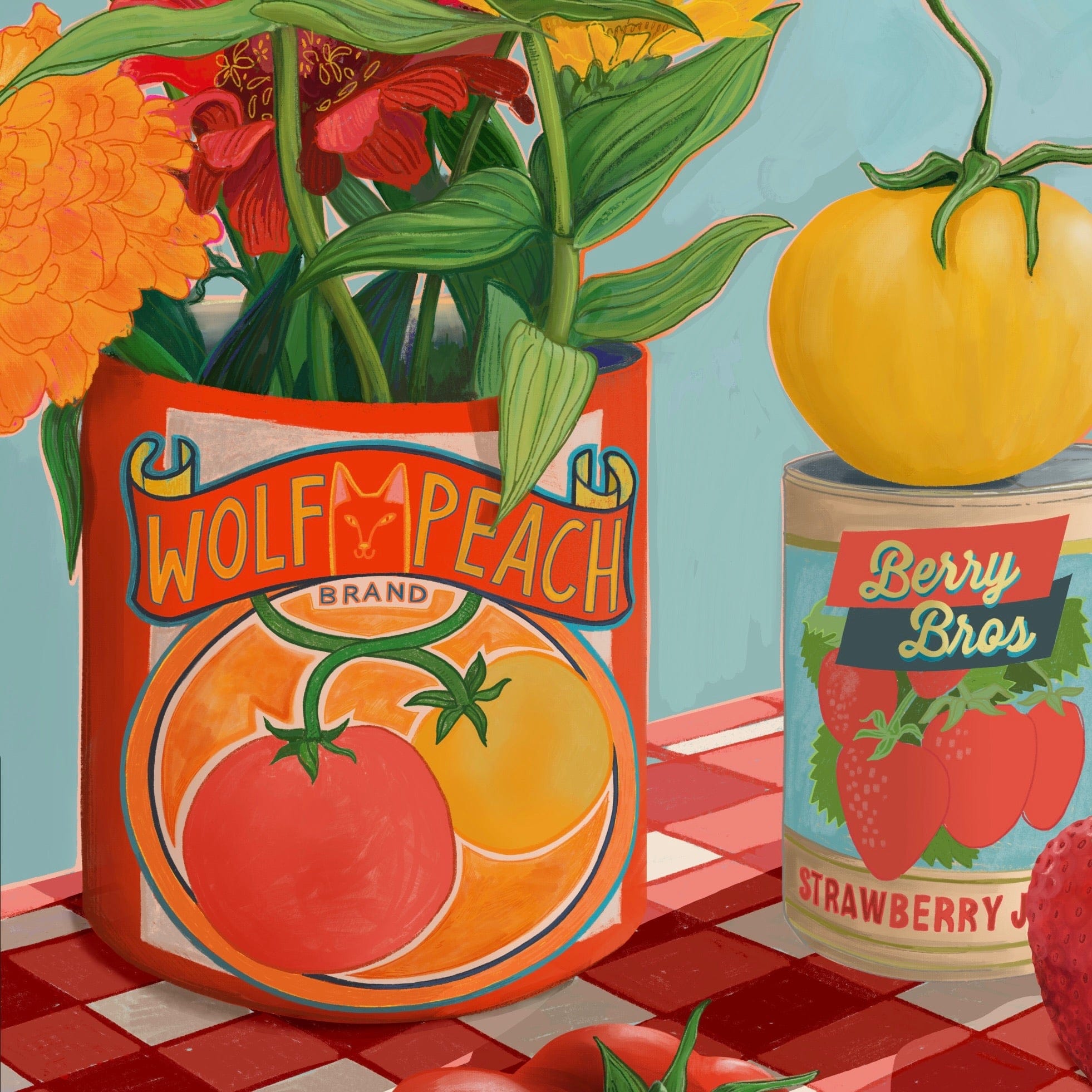
I can only urge you to google wolf peach and read the full history because it’s a wild and very unexpected one. So why the Wolf Peach? The old Greek name given to tomatoes (now more heirloom tomatoes of yellow or different colours) was Lycopersicon which translates to wolf peach.
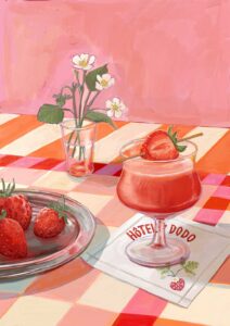
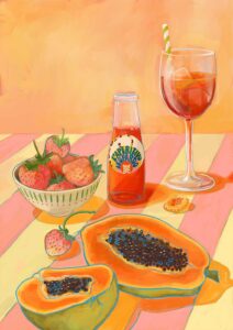
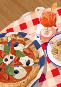
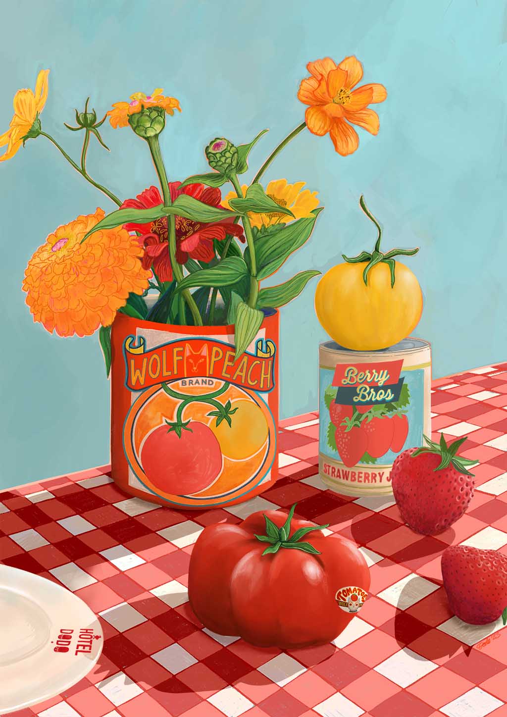
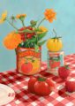
I paired them in this decidedly Mediterranean setting for the Hotel Dodo series with strawberries because adding to the multifaceted nature…tomatoes are also a fruit and a berry no less!
Now let that all sink in…..and don’t forget to google wolf peach 😉
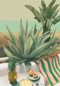
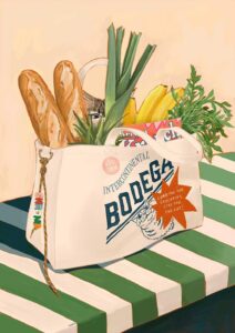
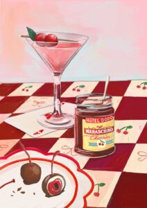
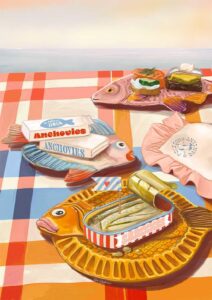
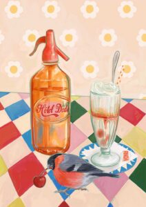
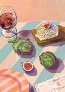
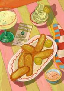
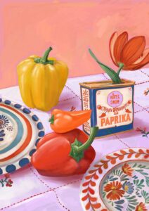
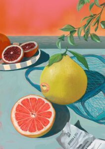
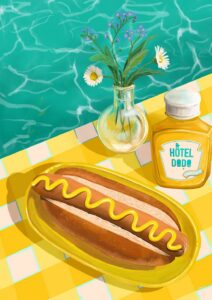
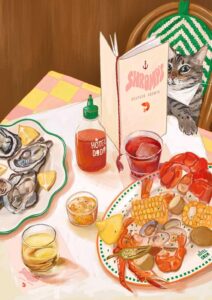
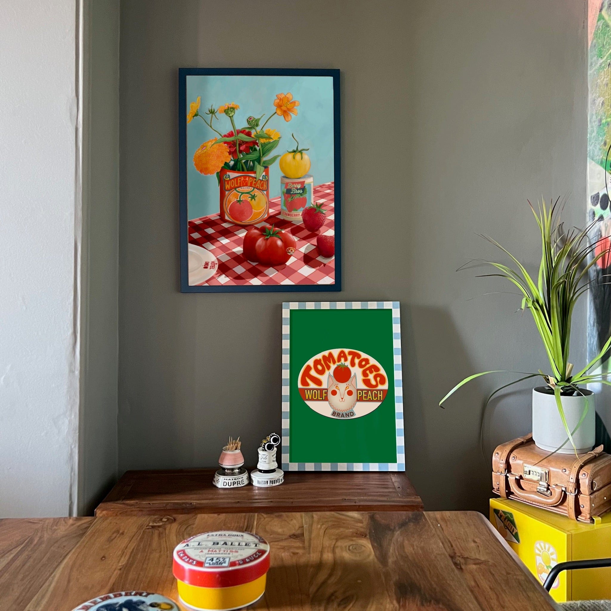
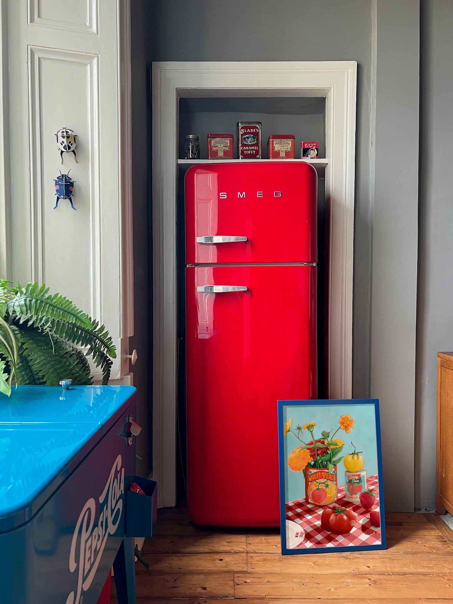
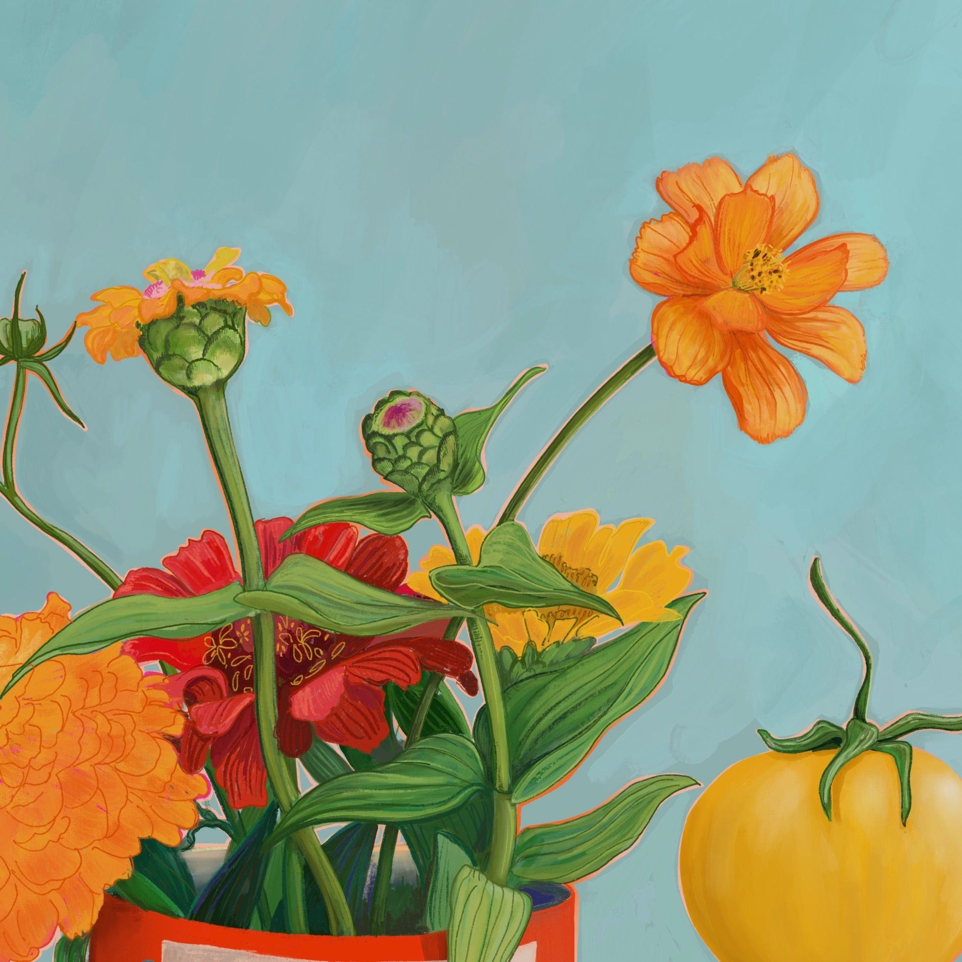
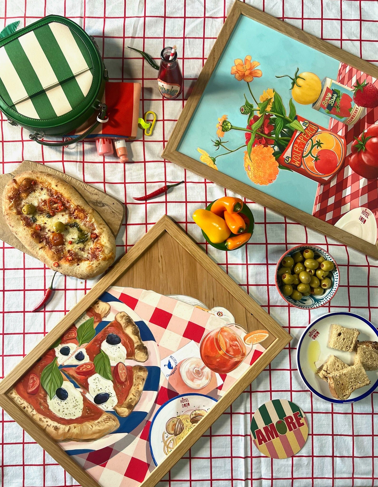
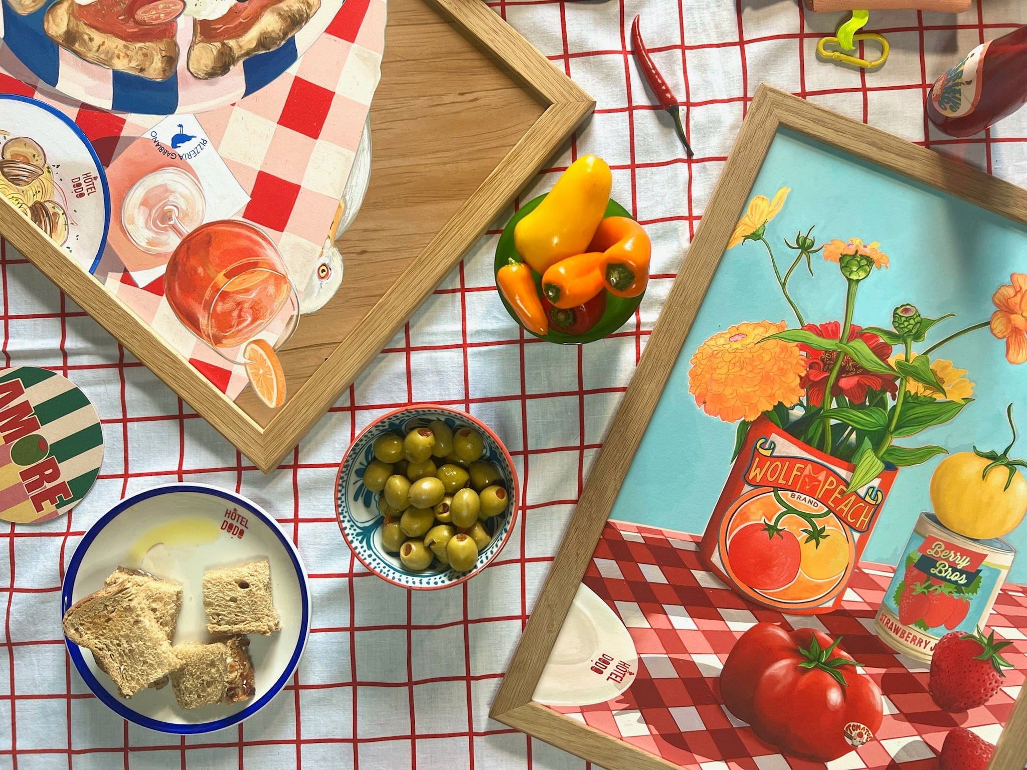
Tomato red, warm tangerine orange, dusty marigold yellow, soft sky blue, and deep forest green – these are the colours that animate this cheerful still life, and they make it surprisingly versatile on the wall. The print’s palette runs warm overall, anchored by those rich reds and oranges, which means it sings against walls painted in terracotta, warm cream, or a muted brick rose – all tonal neighbours that let the composition breathe without competing. The cool sky blue of the background offers a complementary counterpoint, so a deep teal-leaning sage or a faded duck-egg wall will draw that quieter note forward for a fresher, more summery feel. Avoid stark cool greys; their blue-cast undertones will flatten the warmth the image depends on. In terms of style, this print suits a relaxed Provençal kitchen, a mid-century modern dining space, a cottagecore interior rich in natural texture, or a maximalist gallery wall that revels in pattern and colour. Naturally it belongs in a kitchen or dining room – above a café-style table, propped on a dresser shelf among crockery, or grouped with other prints from the Hôtel Dodo collection, an imaginary resort built around retro holiday nostalgia and that blissful "nothing to do, nowhere to go" energy. It makes a thoughtful gift for gardeners, cooks, or anyone who needs a little sun-soaked calm on their walls year-round.
Printed with archival pigment inks on Hahnemühle Photo Rag® – a museum-grade cotton rag paper with a soft felt texture – the surface is fully matte and glare-free, which means it reads just as well under kitchen spotlights as it does in softer dining-room light, and suits everything from a slim oak frame to an ornate vintage gilt. The A4 and A3 sizes fit neatly on a shelf or into a gallery arrangement; the A2 and A3 work as confident standalone pieces above a sideboard or bench; the A1 and A0 have the presence to anchor a whole dining-room wall, filling the space with the warmth and generosity of a proper still life. This print is also available as a ready-to-hang canvas print measuring 28×40 inches (70×100 cm), requiring no frame.