


Choose Your Print Size
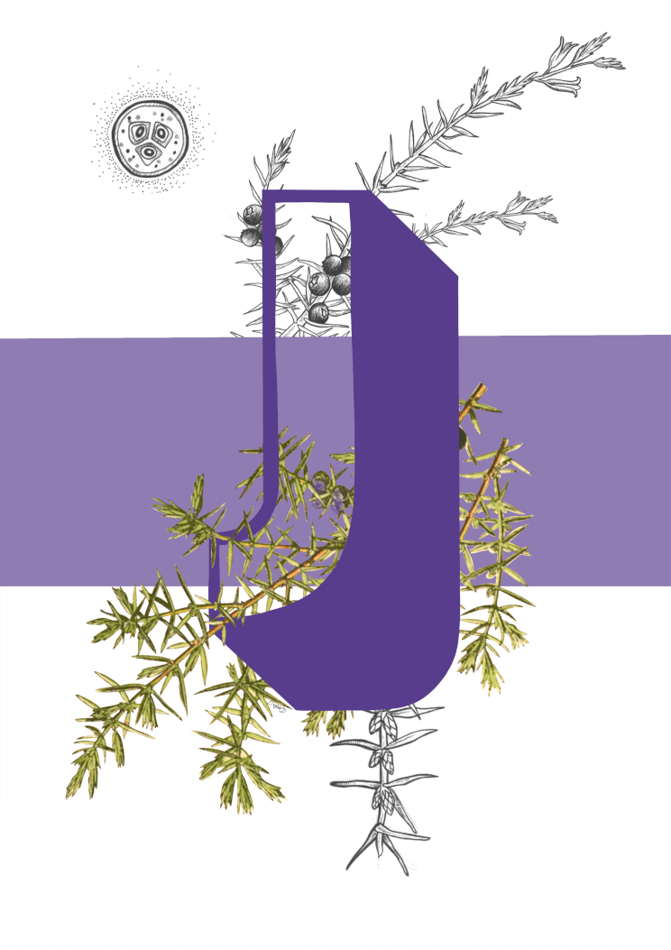
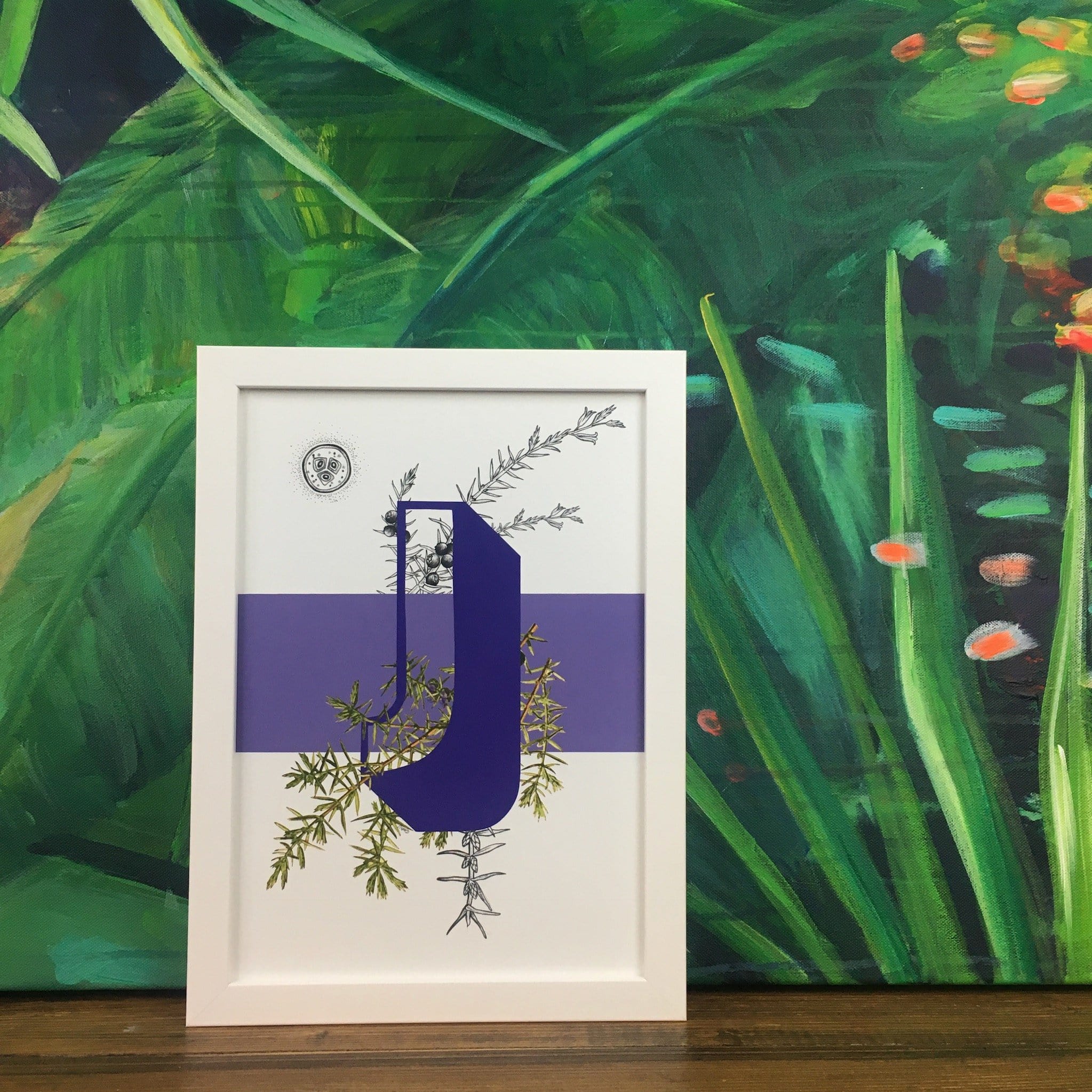
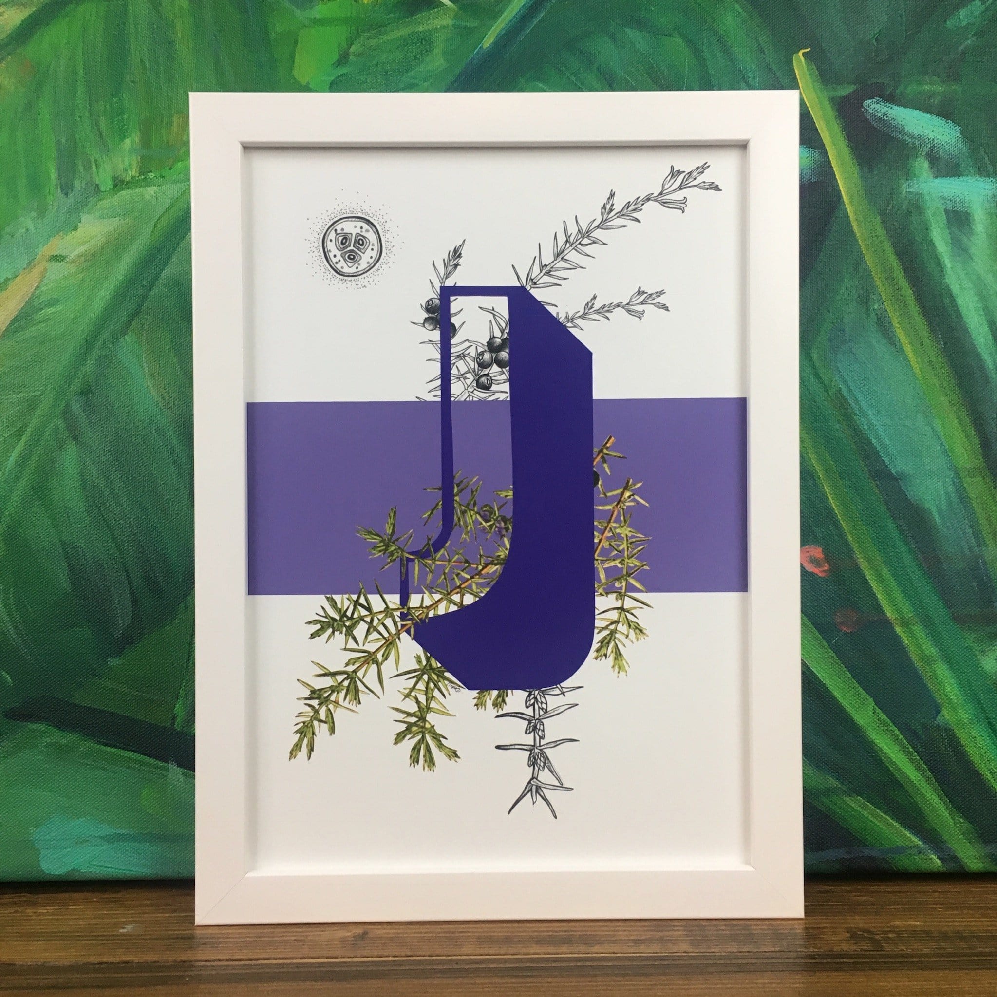
J is for Juniper.
Best known for their part in producing gin, juniper berries are also used in many countries to make sauces and accompaniments to game meat and traditional dishes.
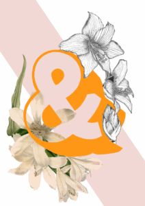
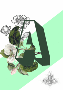
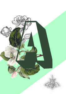
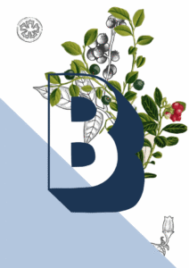
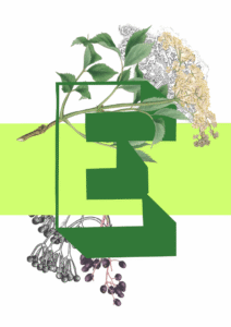
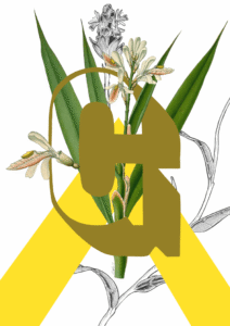
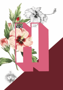
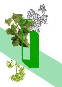
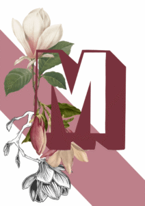
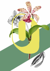
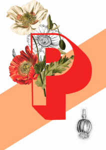
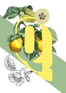
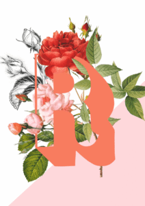
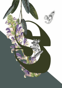
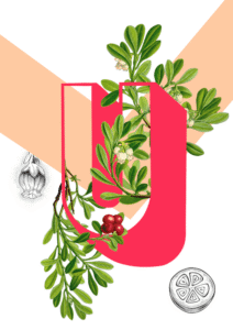
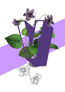
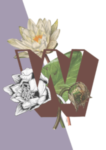
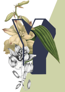
The Botanical Alphabet is inspired by old scientific botanical illustrations and categories of olden day Explorers and Naturists. Paired with modern outlined sans serif letters and bold colour blocks, it has a much more contemporary feel while still keeping a hint of the much loved illustration genre of the past.
The Botanical Alphabet series is also available as greeting cards, so you can send a very personal card for any occasion featuring your friend’s initial.
Deep violet-purple sits at the heart of this print – a cool, blue-leaning purple that reads almost ink-dark in some light – anchored by the warm olive and khaki greens of the juniper branches and lifted by the soft mid-lavender of the horizontal colour block. Against those botanical greens, a chalky off-white ground keeps everything fresh. Walls in a cool-toned pale sage or dusty eucalyptus green would draw out the juniper foliage and feel quietly harmonious, sitting in the same cool-but-natural neighbourhood as the print’s own palette. For contrast, a warm terracotta or burnt clay wall makes the violet letter sing against it, the complementary tension between orange-red and blue-purple doing all the work. If you prefer neutrals, choose a white with a faint grey or lilac undertone rather than a creamy warm white, so the cooler tones in the print don’t fight the wall behind them. This print belongs to the Botanical Alphabet collection – a series that fuses vintage scientific illustration with bold modern typography, each letter paired with a plant that shares its initial – and it sits naturally alongside other prints from the collection on a gallery wall, whether you’re spelling something out or building the full alphabet. The mood here is considered and slightly moody, making it well suited to a study, a home library, or a sitting room rather than a nursery or bright kitchen; hang it beside a window where the greens catch natural light. Style-wise, it suits a botanical maximalist interior, a modern heritage scheme, an eclectic study, or a Scandi-influenced space where a single hit of colour grounds an otherwise restrained room. It makes a thoughtful gift for anyone who loves the natural world, typography, or the letter J.
The print is produced using archival pigment inks on Enhanced Matte art paper, a smooth gallery-grade stock that carries fine botanical line work with real clarity; the soft, glare-free surface means no hotspots under picture lights, and the finish sits comfortably behind both slim modern frames and more ornate vintage mouldings, making it genuinely museum-grade in the way it handles the ink. An A4 (21 × 29.7 cm) print works well propped on a bookshelf or as part of a close-hung gallery wall; A3 (29.7 × 42 cm) holds its own as a single piece on a desk or side wall; A2 (42 × 59.4 cm) steps up into proper statement territory, ideal for a chimney breast or a reading nook; and A1 (59.4 × 84.1 cm), the largest size, has the presence to anchor an entire wall in a study or hallway. This print is also available as a ready-to-hang canvas print measuring 28 × 40 inches (70 × 100 cm), which needs no frame.