
Choose Your Print Size
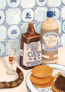
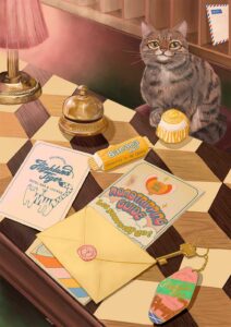
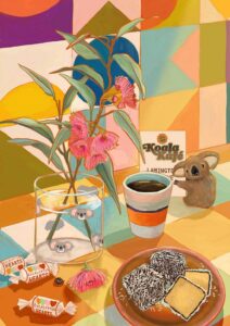
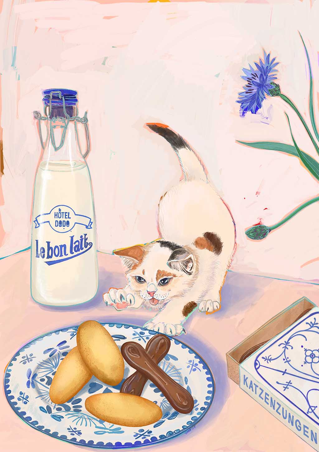
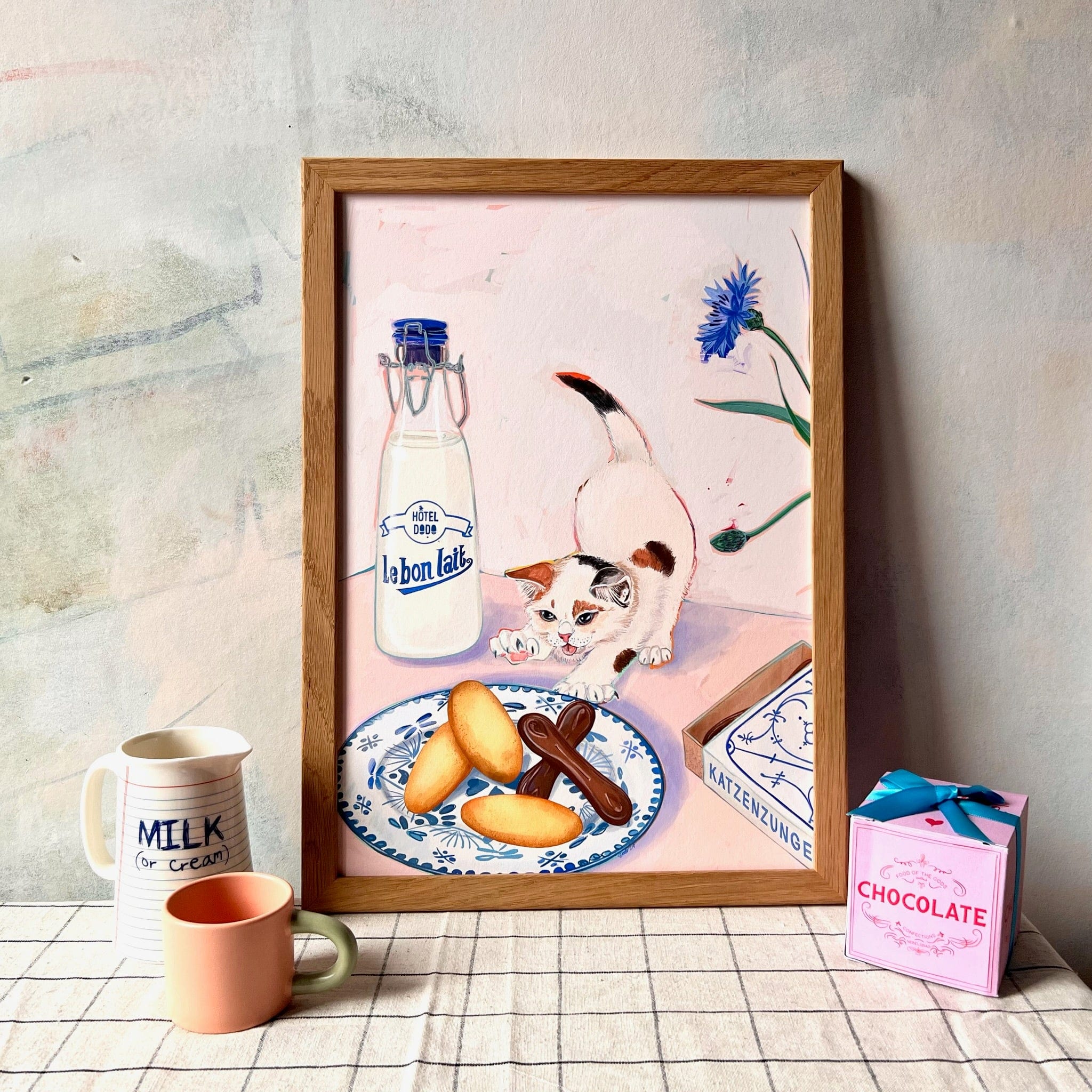
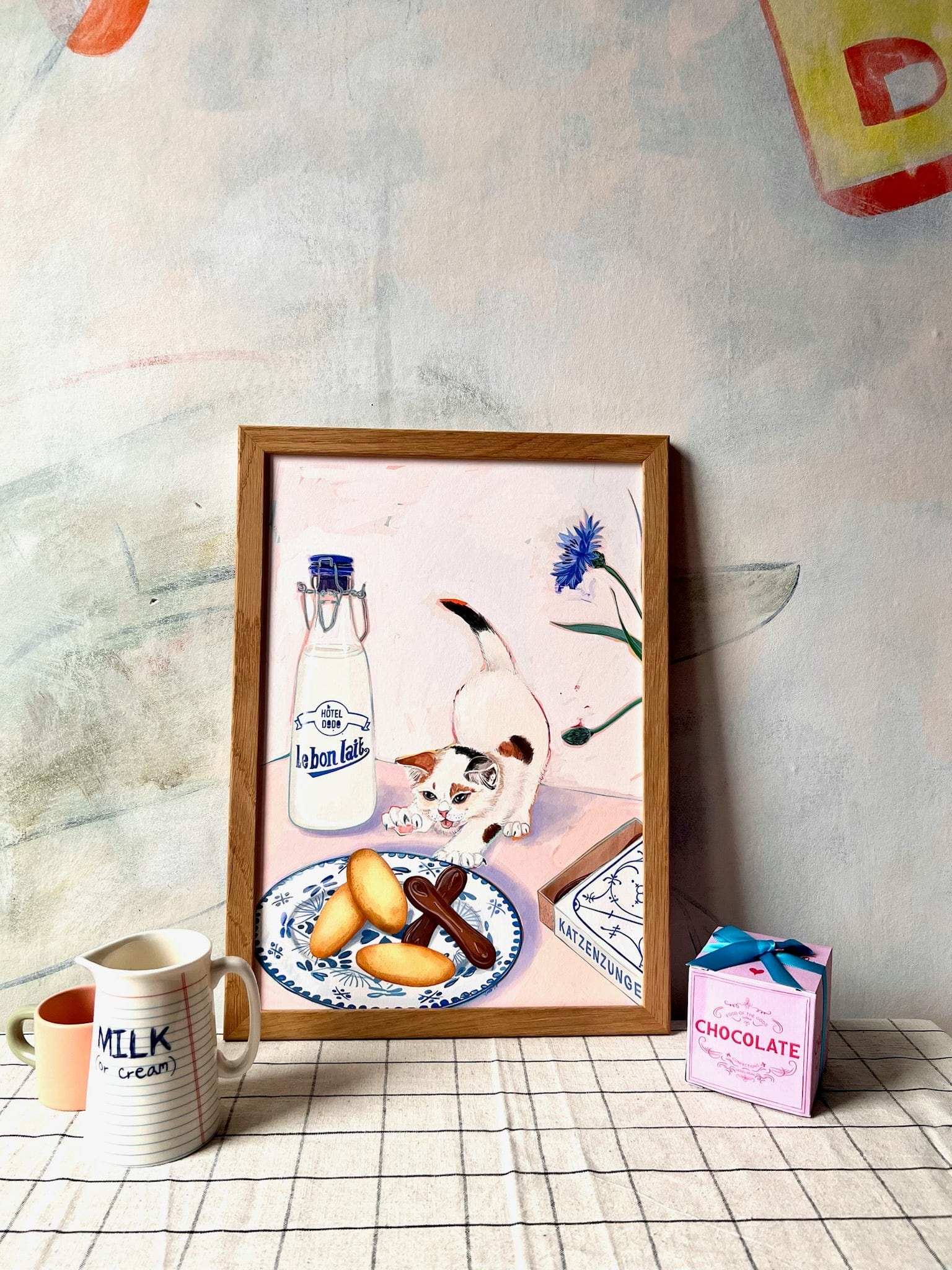
Sweet treats named after cats’ body parts?? So this one is an ode to a French baked treat, and a German chocolate treat, both called “cats tongues”. That’s a bit morbid I hear you think…and yes I agree but wait till you see the retro packaging of the German Katzenzungen…it features adorable little kittens in fine potat shape….all thoughts of weirdness are dispersed and replaced by only “aaaawww…..now gimme the chocolate I’m in!”
The french version (langues de chat) does not feature tiny felines on the package but rest assured the golden baked goods are just as cute and edible!
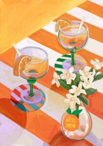
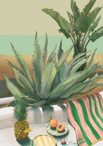
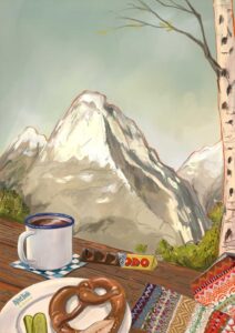
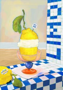
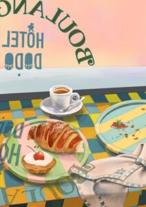
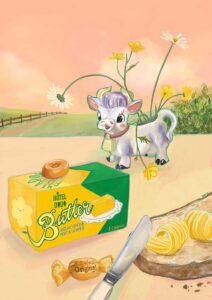
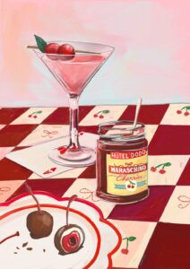
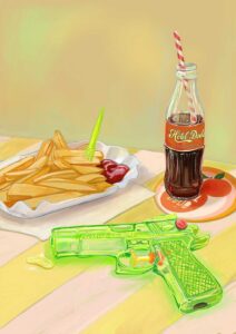
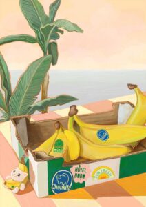
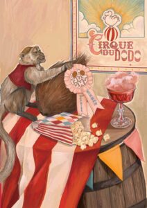
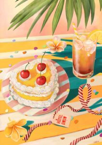
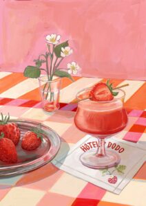
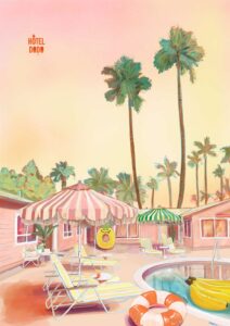
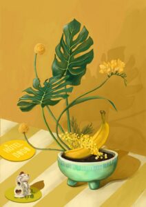
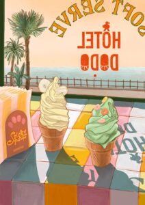
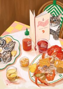
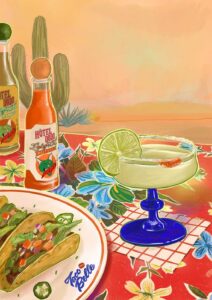
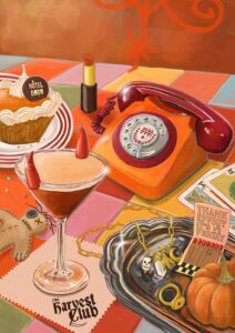
Hôtel Dodo is a place, or better a tiny universe, that exists in my head allowing me to mind travel. Not dissimilar to the concept of a mind palace that makes remembering things easier.
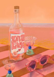
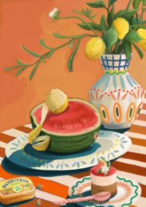
My little universe is all about moments of calm, appreciating the little things, sun soaked lazy holiday lunches, beautifully curated table settings, and overall that “nothing to do, nowhere to go” energy.
Each setting invites the viewer to take a seat and the table, focus on the calm before them and be transported elsewhere for a little while.
See you in the gift shop at Hôtel Dodo! X
Soft blush pink dominates this print – the warm, dusty kind you’d find on an old plaster wall in a Provençal kitchen – undercut by cool blue-white milk glass, cobalt and cornflower blue, and accents of warm biscuit tan and chocolate brown, with dashes of sage green from the flower stems. That palette runs warm overall, so it sits happily against walls in pale terracotta, warm off-white with a peachy undertone, or a muted dusty rose that echoes the background’s blush. The cobalt in the milk bottle and the Delftware plate is strong enough to carry a contrast pairing, meaning a chalky powder-blue or soft slate-blue wall brings those cooler accents forward beautifully. For a fully tonal scheme, a warm greige or linen white with yellow undertones honours the biscuit browns without competing. In terms of style, the Delftware plate, the illustrated lettering and the retro milk bottle point clearly towards French country, vintage European, and maximalist eclectic interiors, while the loose painterly brushwork and restrained palette also work in a soft contemporary setting. A kitchen, a breakfast room, a child’s bedroom, or a sunny reading nook are its natural homes – anywhere food, comfort and gentle play overlap. This print belongs to the Hôtel Dodo collection, an imaginary resort of retro holiday nostalgia and joyous calm; it pairs naturally with other prints from that collection for a gallery wall full of "nothing to do, nowhere to go" ease. It would make a particularly lovely gift for a cat lover, a Francophile, or anyone who takes their biscuit selection seriously.
The print is produced with archival pigment inks on Hahnemühle Photo Rag®, a museum-grade cotton paper with a subtle felt texture and a matte, glare-free surface that reads softly in natural and artificial light alike – no reflections to fight when you’re eating breakfast opposite it. That matte finish suits both slim modern frames and ornate vintage ones with equal ease. At A4 (21 × 29.7 cm) or A3 (29.7 × 42 cm) it works propped on a kitchen shelf or slotted into a gallery wall arrangement; A2 (42 × 59.4 cm) gives it enough presence to hold its own above a sideboard or beside a window. A1 (59.4 × 84.1 cm) becomes a proper focal point in a dining room or bedroom, and A0 (84.1 × 118.9 cm) fills a wall with the full warmth and detail of the scene. This print is also available as a 28 × 40 inch (70 × 100 cm) canvas, ready to hang with no frame needed.