
Choose Your Print Size
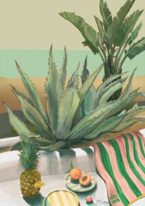
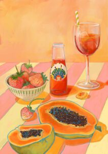
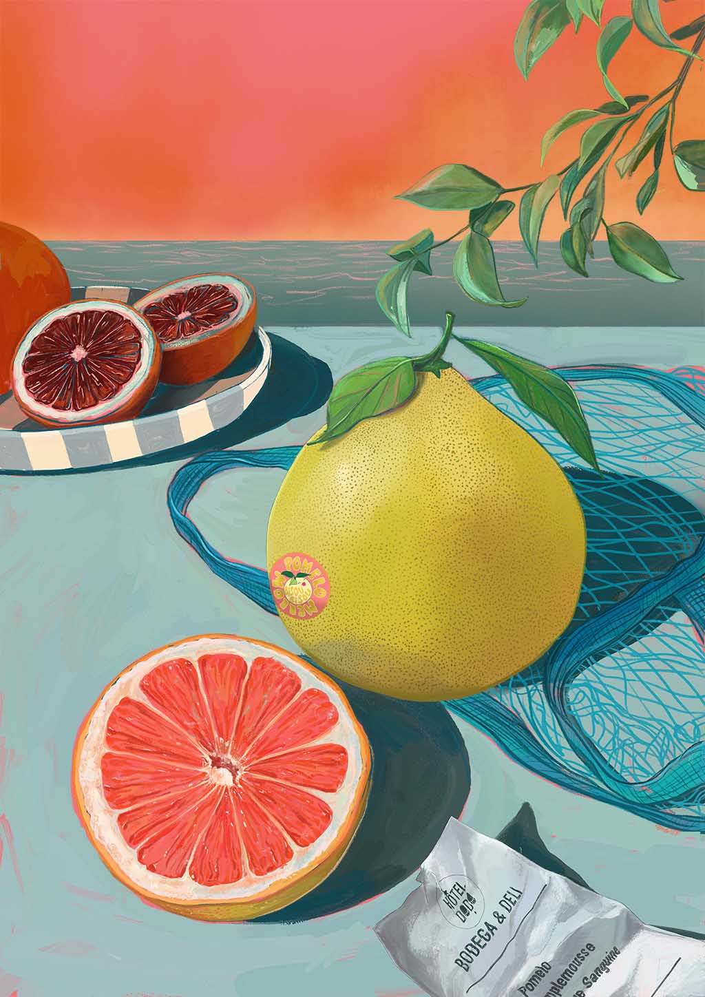
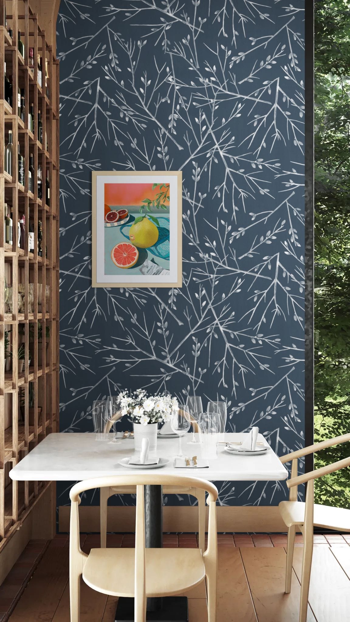
Is a pomelo just a fancy named grapefruit? Oh contraire…..it’s kinda a parent of what we call grapefruit now: our now typical grapefruit came about by crossing a pomelo with an orange!
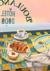
That is also why I added a cup open grapefruit and a plate of blood oranges in the table setting. Naturally these were purchased at Hôtel Dodo’s very own bodega and deli!
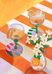
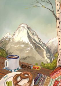
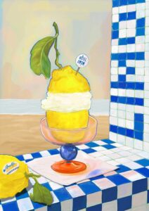
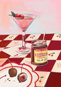
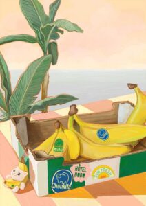
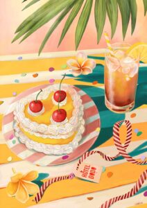
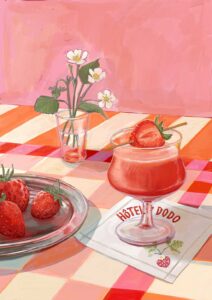
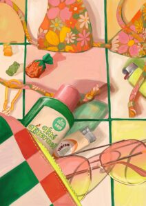
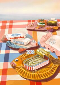
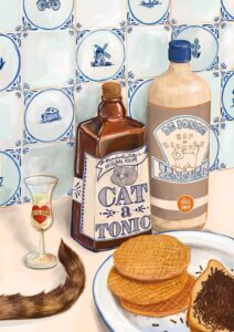
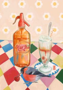
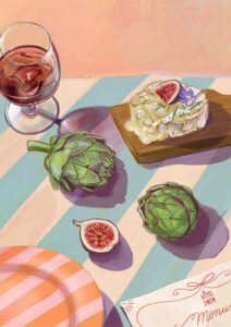
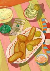
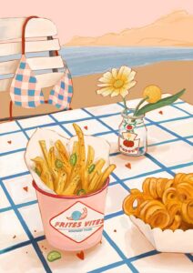
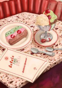
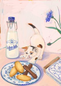
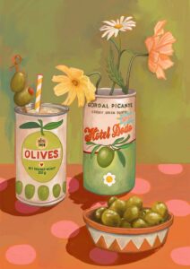
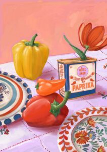
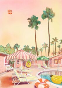
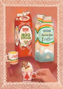
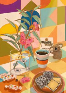
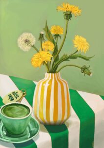
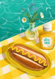
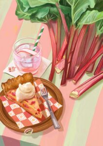
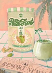
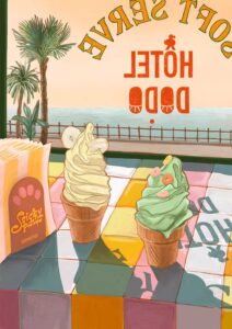
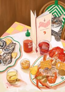
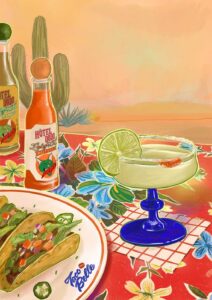
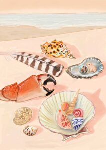
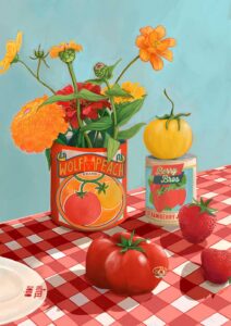
Hôtel Dodo is a place, or better a tiny universe, that exists in my head allowing me to mind travel. Not dissimilar to the concept of a mind palace that makes remembering things easier.
My little universe is all about moments of calm, appreciating the little things, sun soaked lazy holiday lunches, beautifully curated table settings, and overall that “nothing to do, nowhere to go” energy.
Each setting invites the viewer to take a seat and the table, focus on the calm before them and be transported elsewhere for a little while.
See you in the gift shop at Hôtel Dodo! X
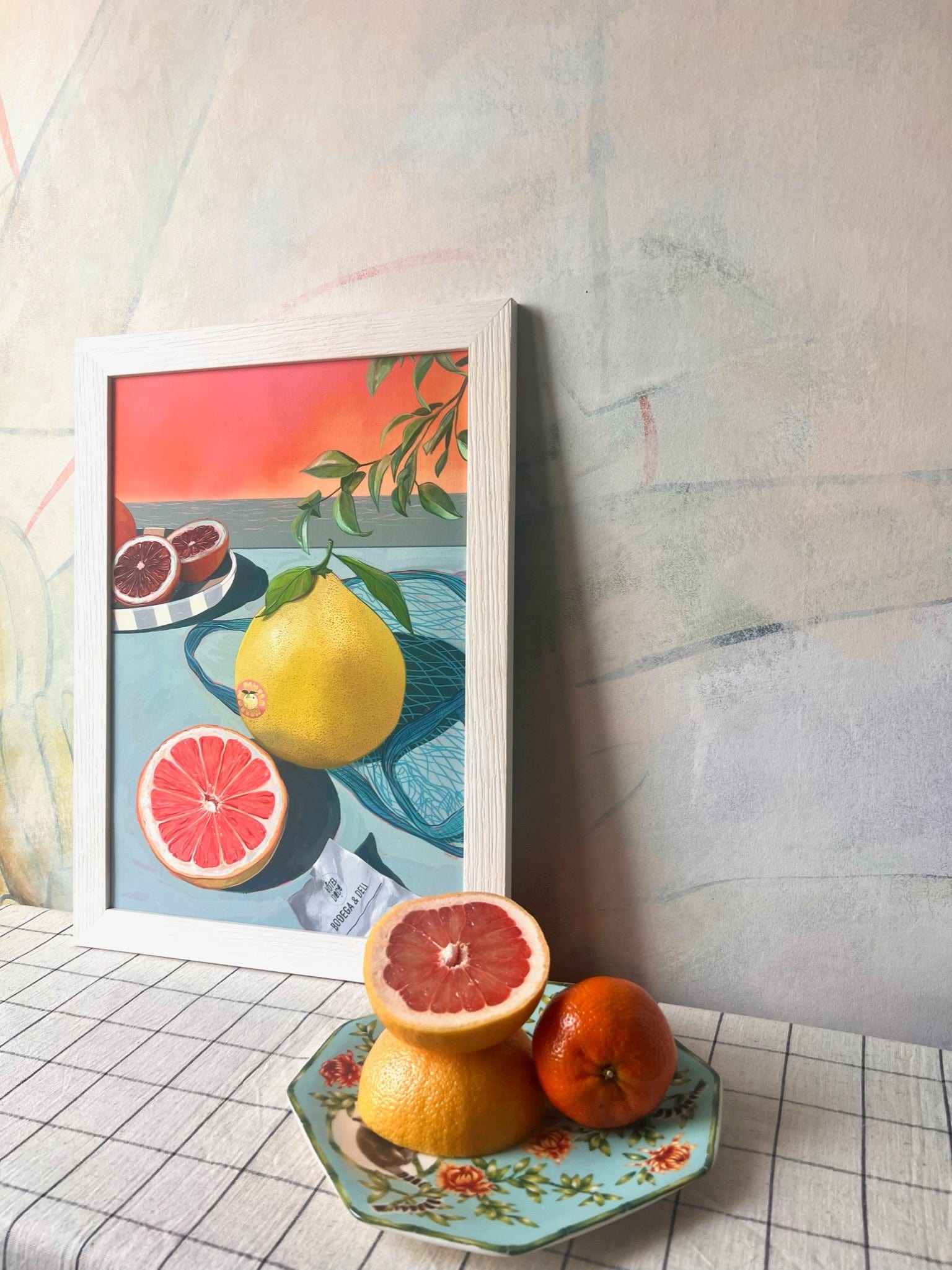
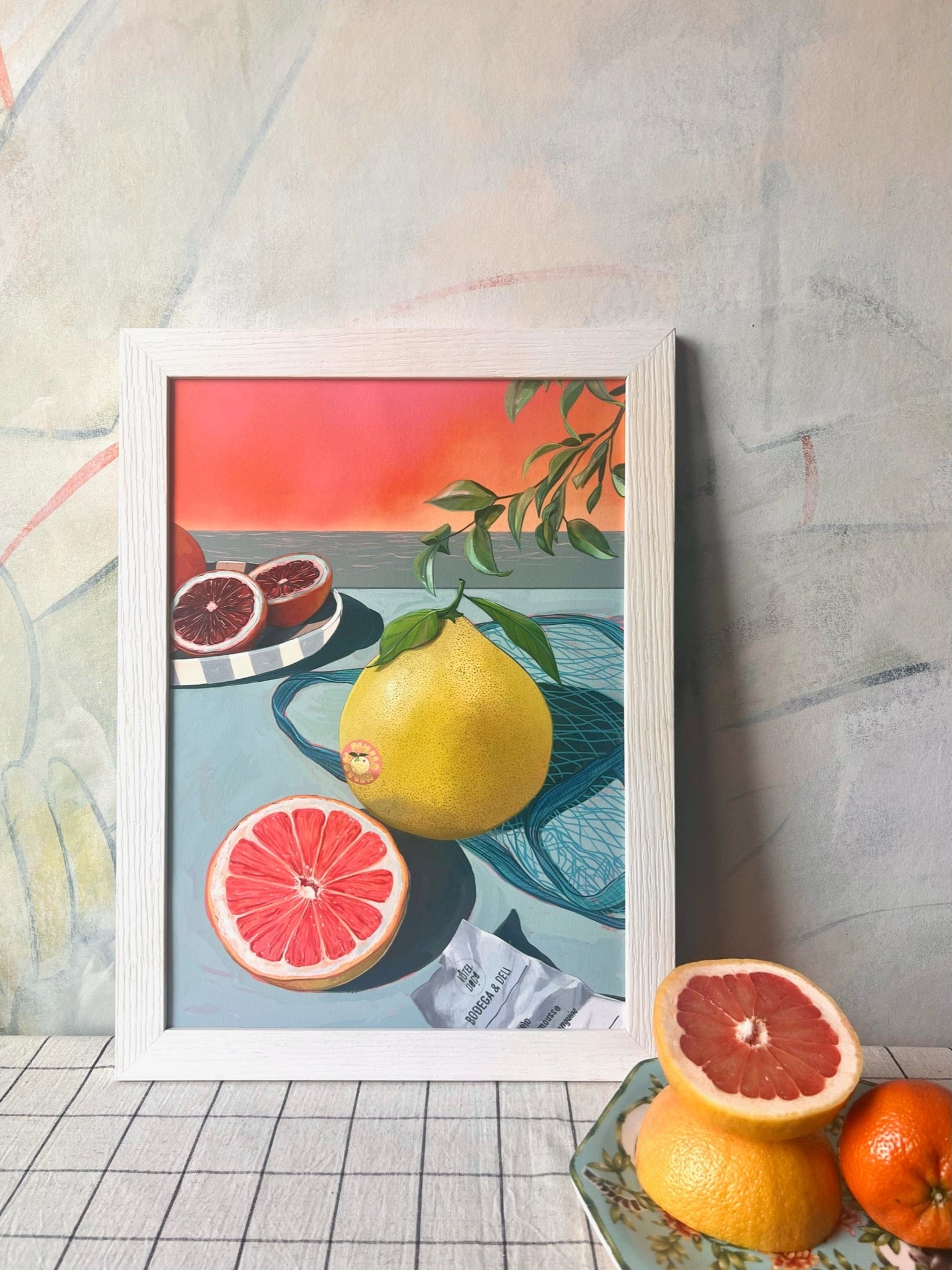
Coral-red sky, warm terracotta orange, soft sage and muted teal, buttery yellow-green, and a deep burgundy-crimson in the cut blood oranges – these are the colours that make this print immediately readable across a room, and they steer the wall-colour conversation in a clear direction. The warm coral and terracotta tones carry strong red-orange undertones, so walls in a warm off-white with a peachy or apricot cast will sit harmoniously alongside them; equally, a deep dusty terracotta on a single accent wall echoes the sky without competing. The sage and muted teal introduce cooler, greyed greens that open the door to a soft sage-green wall – an analogous move that feels cohesive and calm. For contrast, a warm charcoal with brown rather than blue undertones will ground the print’s brightness and make the buttery pomelo practically glow. In terms of style, a stylist would reach for this print for a Mediterranean or Riviera-inflected interior, a modern maximalist scheme that layers pattern and colour with confidence, a relaxed coastal room, or a retro-tinged mid-century setting where the bold flat colour blocks feel entirely at home. It belongs in a kitchen or dining room where it channels that sun-soaked lazy-lunch energy, or in a bathroom where the citrus and teal read as genuinely refreshing; hang it where natural light catches it in the morning. The print is part of Hôtel Dodo, an imaginary resort built on retro holiday nostalgia and joyous calm – that "nothing to do, nowhere to go" feeling – and it pairs naturally with other prints from the collection to build a poolside gallery wall. It makes an easy, considered gift for anyone who travels through food, colour and daydream.
Printed with archival pigment inks on Hahnemühle Photo Rag® – a museum-grade cotton paper with a subtle felt texture – this giclée has a matte, glare-free surface that works well in both slim contemporary frames and more ornate vintage ones, since there is no sheen to catch awkward reflections. At A4 (21 × 29.7 cm) or A3 (29.7 × 42 cm) it sits comfortably on a shelf or contributes to a tightly curated gallery wall; at A2 (42 × 59.4 cm) it holds its own as a standalone piece above a sideboard or beside a kitchen dresser; A1 (59.4 × 84.1 cm) brings genuine presence to a dining room or wide hallway, and A0 (84.1 × 118.9 cm) is large enough to anchor an entire wall, filling a room with that warm, holiday-still atmosphere the Hôtel Dodo collection is built around. This print is also available as a 28 × 40 inch (70 × 100 cm) canvas, ready to hang with no frame needed.